Iterative design is critical to a product or vision that a creator has conceived. In my opinion, design iteration can sometimes be about obsession, persistence, and the focus to keep things simple. It’s more of improving the small details to make technology become a more seamless extension of ourselves. Designing software interfaces is still about making computers easier for humans to use. That’s why designers got into the game in the first place. Many of the software products or applications I work on is never considered finished. The user interface and the user experience is constantly being tweaked and modified to enhance the human experience.
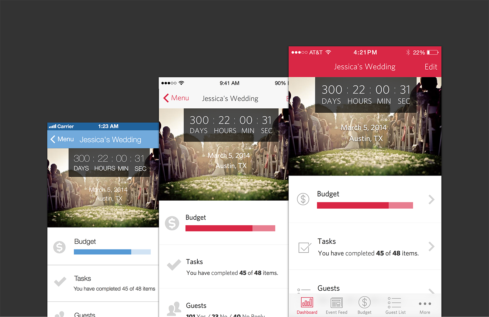
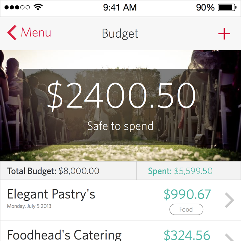
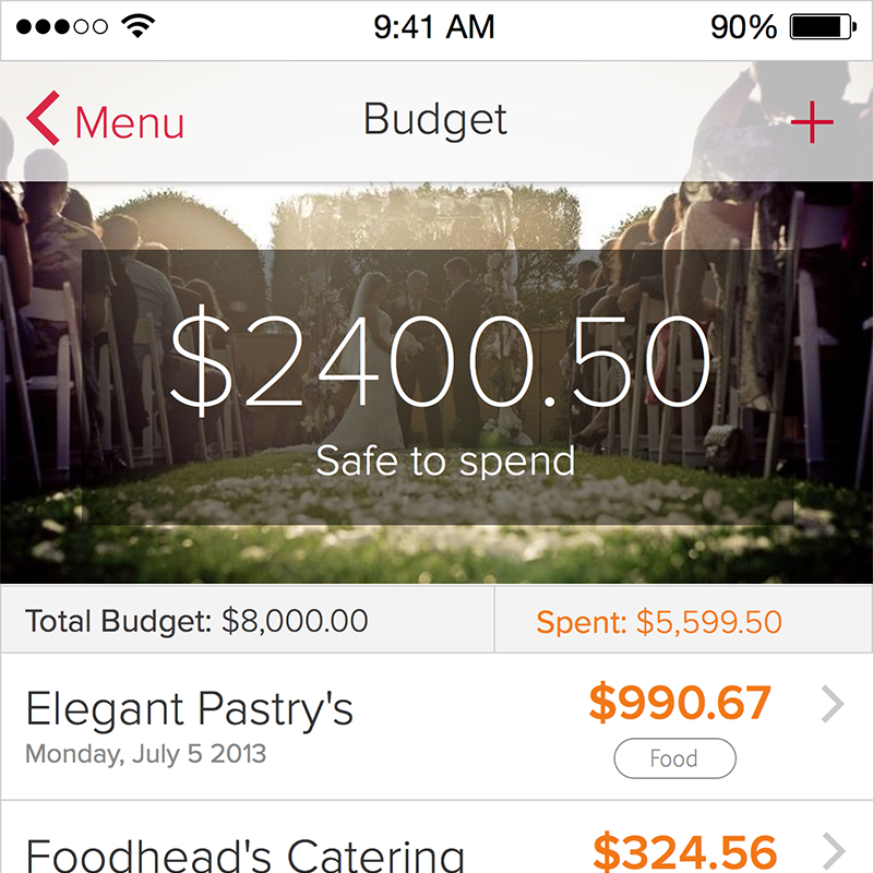
Below are some designs of an old project that have gone under several subtle iterations. Some of these changes involve typography, colors, icons, copy placement and controls. You’ll notice that all iterations are similar in regards to user experience. The app shown below follow loosely, the guidelines that are written in the iOS Human Interface Guidelines. Most of the focus have been on small tweaks described in the HIG.
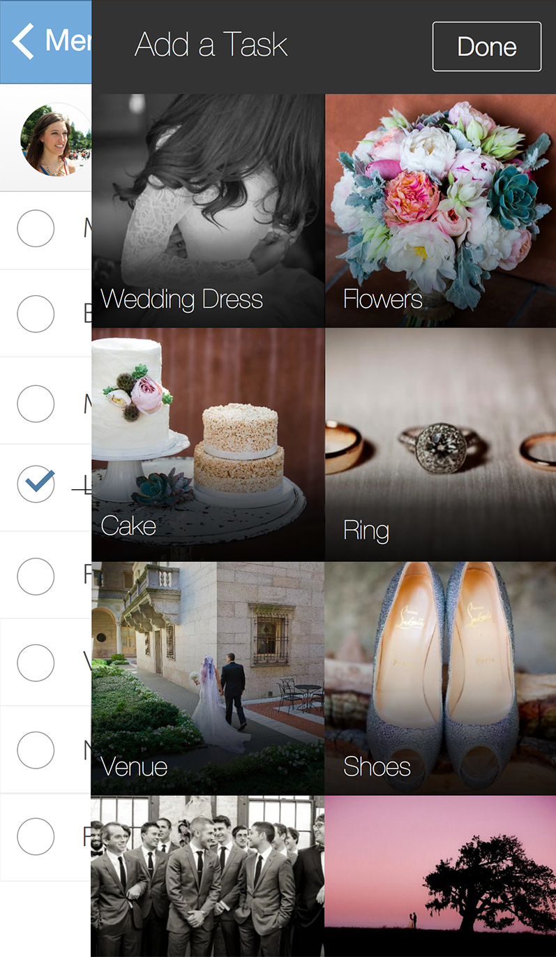
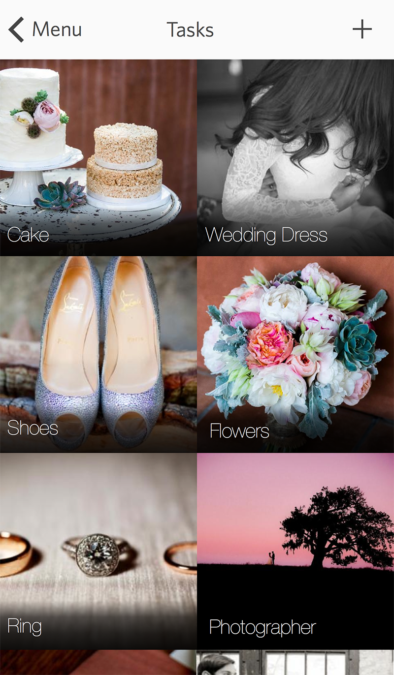
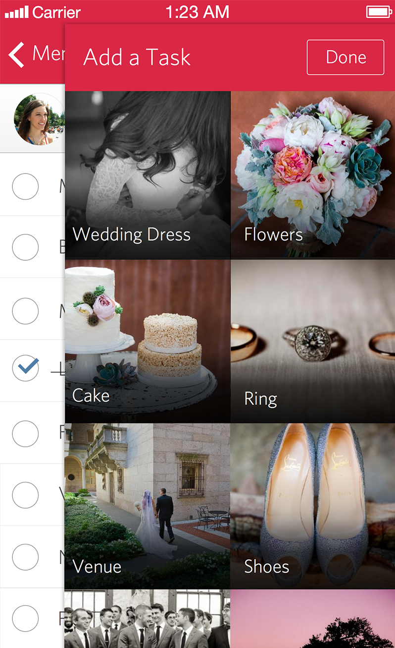
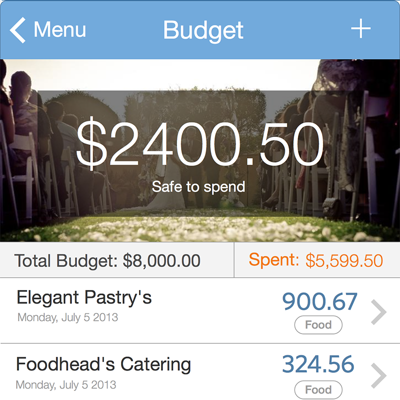
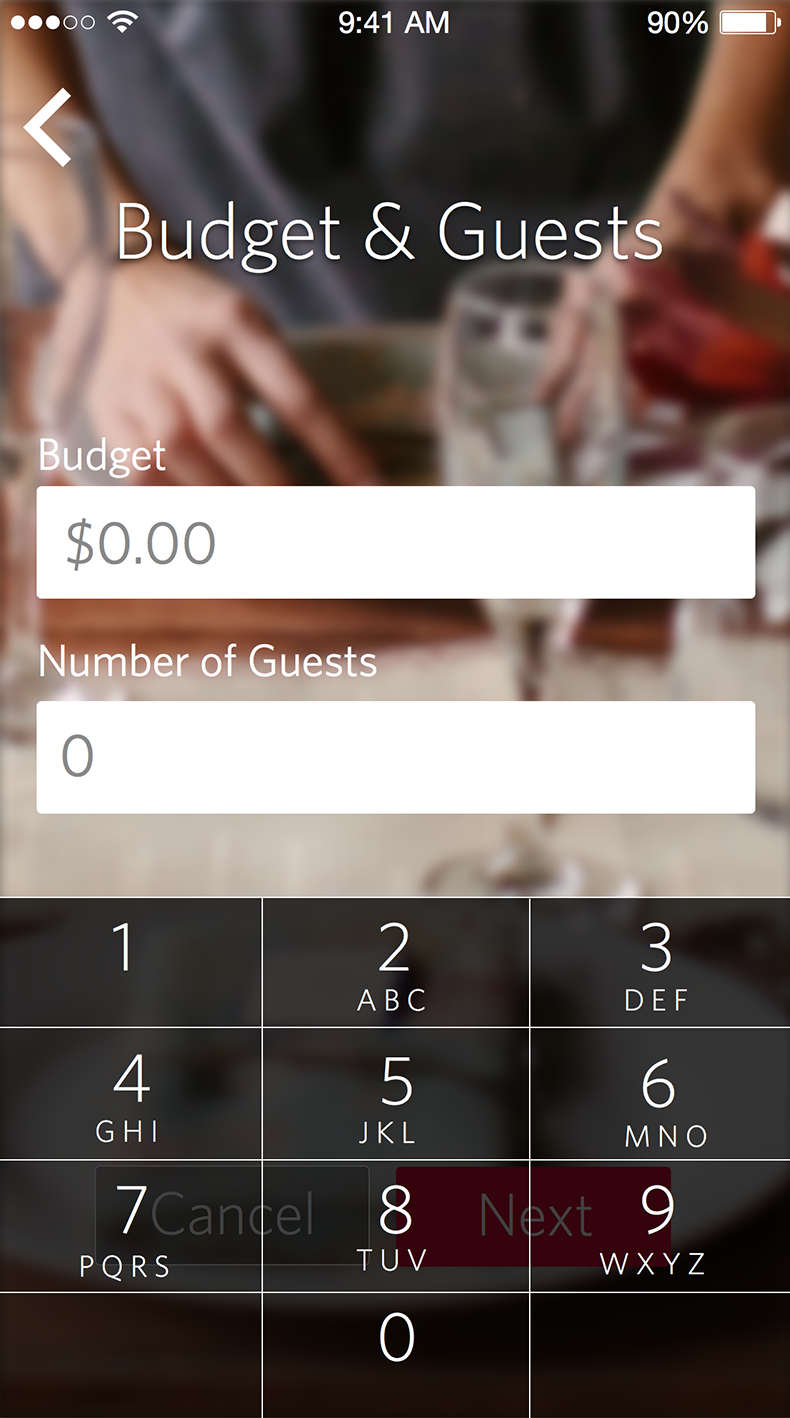
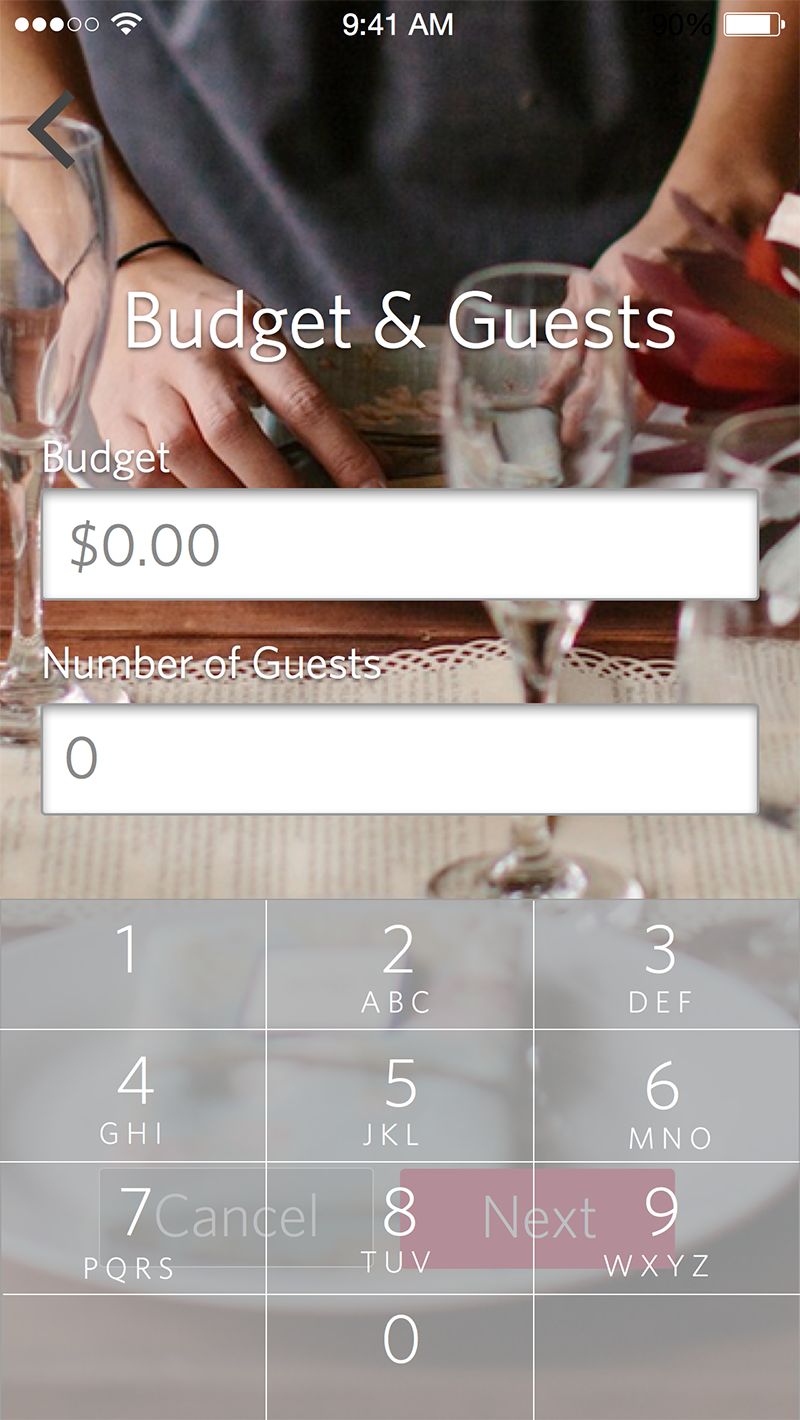
The thumbnails displayed are from a design I created a couple of years ago. I consider it dated and I cringe a little looking at the final results. I would change quite a few things to the overall design. But it’s a great example of the various stages this app has taken to get to it’s final destination. The designs shown above have been unchanged. I closed this project a long time ago.
The overall layout has stayed the same. The early stage mock ups (sketched with pencil and paper) cemented how the user experience was going to function. Many of the little changes were in the small details. If you observe closely, you can see how a slight change in color or typeface can dramatically change the tone of the design. This can impact the emotional connection a user has with this app in a very big way.
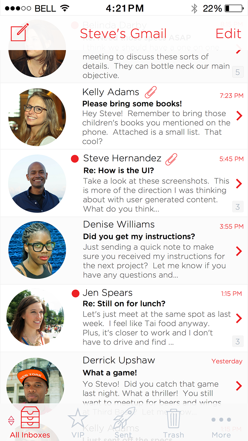
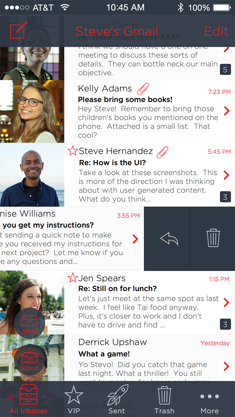
The mobile mail client shown above has been altered slightly. There has only been a color change. The typeface remained the same. The layout has been unaltered. Even the color of the icons have remained the same. But you can see a huge difference by masking the entire app in white instead of dark blue (final design). The white color gives the app a more elegant and honest look. The blue version gives the design a playful and modern signature. Which version do you think may out last the other? In other words, which design is more timeless? Which one may stand the test of time and not seem outdated?
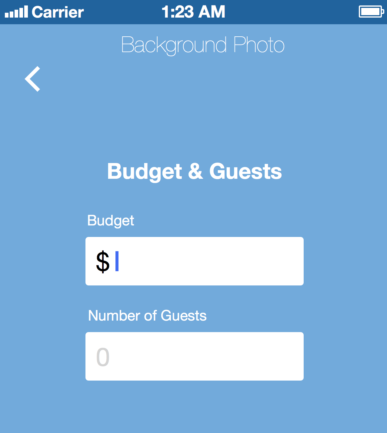
I recently designed a mobile calendar and I wanted to discuss my thought process for my final design.