I created several mockups of a mobile iOS app called WikiBand. This idea has gone through several iterations during the past year. In fact, it has changed drastically since it’s inception. You can just look at the difference between the headline screen shot of this post and what can be discovered from my portfolio. Anyway, I started to code the most recent designs of my mockups. I thought it would be a nice idea to document the process on this website.
The posts devoted to WikiBand and the process of making it into a living and breathing piece of software will be sporadic. But I hope the act of journaling the effort will pay me handsomely sometime in the future. The actual posts won’t be a step-by-step recipe of how the app is constructed. I just want to highlight some of the key aspects of technology that was required to bring this design to the screen.
The WikiBand app is primarily for iOS. The main goal of the app is to provide an enjoyable way for discovering new music. The app is meant to tie into the iTunes store and suggestion songs or albums that may be missing from your personal music library. That is all the details I am going to release for now. Just in case someone else other than my 2 friends read this blog post. Also, the app is written in Objective-C and not Swift. Objective-C is more familiar to me and I wasn’t interested in jumping into the Swift band wagon just yet.
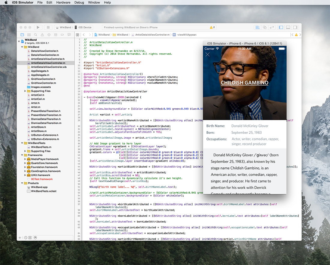
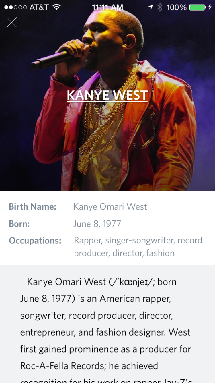
Now that the introduction is out of the way. At it’s core, WikiBand is a Wikipedia client devoted to music. That’s it! Simple. Of course, it will be a whole lot more feature wise. But I’ll go into details about that in another blog post. For now, let’s discuss one particular view or screen that’s part of WikiBand. In fact, it’s the most important view of the app. The details page. Below is a screen shot of the mockups featured in Sketch.

Three different screens of the WikiBand details page.
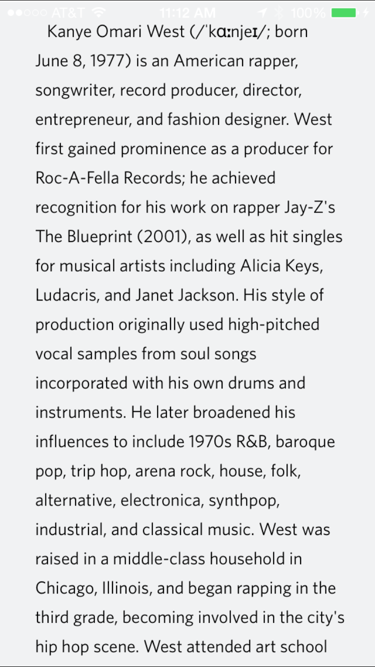
The screen shot displays three artboards (one for Kanye West, Childish Gambino, and Katy Perry). You’ll notice a simple design that highlights three main areas of an artist or band. The hero image, the highlight panel, and biography text. All the content, of course, comes from Wikipedia. Each highlight conveniently fits perfectly into three UIViews called the heroContainer, artistMetaContainer and bioContainer. The figure below shows how each UIView is structured and you can guess what sub-views were added.

Three main UIViews that construct the Details ViewController.
All three UIViews are of course instantiated within a UIViewController. I did use Interface Builder to layout each of the 3 important UIViews and their subviews. I also want to note that each of the 3 main UIViews displayed above are themselves wrapped in a UIScrollView for obvious reasons. Scrolling doesn’t come out of the box when using a good ol’ UIViewController. So far, the layout seems really simple. In fact, all we have to do is hook up the necessary IBOutlets to each of the corresponding labels and we have a working and functioning details view! Not so fast… Everything that comes out of the box via Interface Builder is pretty aweful. I spent quite a bit of time on sweating the small details to get our UIViewController to look exactly like my mockup. The two biggest items that needed work was the typography and the horizontal and vertical alignments of each UIView. I am going to emphasize on both areas because that is where all the heavy lifting was done. As a designer, you want your visualizations to be pixel perfect in code. That goes for any platform (i.e. CSS, HTML or Objective-C). In my opinion, to get the most out of your typography in iOS development, who have to gain a deep understanding of TextKit and Auto Layout. These two key concepts can make or break your designs.
Visual Format Language is the key component to Auto Layout. Auto Layout is a system that allows you (developer) to accurately position each element in your design within a parent view (super view). It’s sort of like markup that can be utilized to precisely align your UIViews in relation to other elements. I like to think of it as iOS’s counterpart to CSS in the browser.
Why is Visual Format Language so important for your designs? Let me step back a little and give more context. Every view’s (i.e. UIView, UIImageView, UILabel, etc…) frame requires a specific height, width and position relative to it’s superview. You’ll typically do this programmatically with CGRectMake or by configuring them in Interface Builder. So, you have just defined each frame of your views using absolute coordinates. That doesn’t seem right does it? Setting each view of your layout makes them extremely fragile because you can’t predict the size of the screen. As a developer, you have no idea if users have an iPhone4, iPhone 5, iPhone 6 or iPhone 6 Plus. Instead of using absolute values to define the locations for your views, you must carefully provide a set of constraints using Visual Format Language (VFL).
But wait just a minute! Interface Builder will set the constraints for me out of the box! Why do I need to use VFL to describe my constraints programmatically? Yes, Interface Builder will setup constraints using Auto Layout when you drop them onto your view. But from my experience, it’ll work only half the time. You still need to step in and make the necessary adjustments using the Auto Layout menu on the Interface Builder canvas. Working that menu tool can get a little complicated. I much rather have a string literal spell out my constraint rules.
Coming from a web background for constructing interfaces with CSS, HTML and JavaScript, I can never get used to laying interfaces with a UI tool like Interface Builder. That’s not how I build things for the web. Why would I change for iOS development. I rather use the following string to describe my layout.
@"H:|-10-[imageView]-10-|"
Shown above is a very simple VFL statement that describes how I want to layout an imageView on my super view. I just set the left-margin and right-margin to my image in relation to it’s parent. The parent view is expressed using the pipe character |. The | character stands for the view’s container. I just expressed 3 lines of CSS with that simple string. In CSS, it can roughly be translated to this…
1
2
3
4
body imageView {
  margin-left: 10px;
  margin-right: 10px;
}
I am not saying that VFL syntax is equivalent to CSS. I am just trying to demonstrate why I prefer to express my Auto Layout constraints in code rather than using Interface Builder. I am used to a mark up language to build interfaces. VFL provides me that type of control. So when I first discovered it, I embraced it.
Let’s take a look at how to approach the vertical constraints of our imageView. To apply margin-top and margin-bottom constraints to my layout, I’ll use the following instruction.
@"V:[dateLabel]-10-[imageView]-10-[textLabel]"
Here, we are setting our imageView’s top and bottom constraints to be 10 points. Top and bottom are mapped from left to right in the string. The image view is 10 points from the date label at the top edge and 10 points from the text label at the bottom edge. Very straight forward to visualize when dealing with multiple views for an iOS app.
Let’s take a look how we can set our width and height parameters for a view.
@"H:[imageView(300)]"
@"V:[imageView(300)]"
We just set our image view to be a 300x300 asset on our super view. We can add constraints for positioning relative to other views on the layout. For a more fleshed out example, the next code snippet is from WikiBand itself. You can see how I set horizontal constraints for the heroContainer, artistMetaContainer and the bioContainer. The three pillars described above that comprise this layout.
I’ll dive into more detail about VFL in another post (hopefully). But for now, I’ll keep everything highlevel. I highly recommend Apple’s documentation on Visual Format Language.
As mentioned previously, there is some extra work required to get your typography looking great on iOS. A simple UITextView or UILabel will not do the trick. Those UIKit classes will not render text nicely out of the box. That initial result will never look anywhere close to what you envisioned in your designs. To get your text pixel perfect, you have to familiarize yourself with TextKit, NSAttributedString and NSParagraphyStyle. Let’s look again at the WikiBand’s details view again.
The font used for WikiBand is Whitney by Hoefler & Co.. Other small details you will notice is the underline and all caps for the artist name. Not to mention the text shadow and subtle kerning to get the title to match the design. To get all these properties properly declared and used for text rendering is NSAttributedString. In fact, all text treatment in the details view uses NSAttributedString. Since iOS 7 was released, Apple transformed their entire design from skeuomorphic to flat. That redesign placed more emphasis on text which prompted them to introduce a wonderful class called NSAttributedString. An NSAttributedString object manages two parameters, NSString and an attributes dictionary. The attributes dictionary holds the set of parameters that are applied to individual characters in the string. Below is a quick list of what those parameters are for rendering a highly customized typeface.
  String Attributes
  Font
  Text or Background color
  Ligature
  Kerning
  Underline
  Strikethrough
  Stroke Width
  Shadow
  Paragraphy Style
Quite a few parameters are required to get your typeface rendered correctly. But the declaration for NSAttributedString makes it really simple to read and setup for specific parts of your text. Let’s take a look at some code.
An NSAttributedString variable called artistNameAttributed is declared and instantiated with an NSString called artistName and attributes dictionary. The attributes dictionary is defined and returned in a method called heroTitleAttributes. Looking at the definition, notice that the font is declared, shadow is initialized and the underline is setup using string properties. NSAttributedString has character attributes that can be declared as dictionary keys and be applied to the text in an attributed string. You just have to refer to the documentation for character attributes to figure out the return value for each key. If you want to override paragraph attributes such as line-height, headIndent and paragraph spacing, just supply a dictionary called NSMutableParagraphyStyle with a set of properties to manipulate those values.

Real pixels of WikiBand's details view.
I’ll just conclude this post with this thought. Typography is one of the most important pieces of your overall design. Some iOS apps are 90% text and maybe 10% animation based. You just have to look at the Mail app that comes with the iPhone. It’s all text and layout. If you have a deep understanding of Auto Layout, Visual Format Language and NSAttributeString, you can bring any of your designs to life on the iOS platform. Focus on the small details when it comes to typography. Your app will look more polished than the competition. I would also recommend reading Butterrick's book on Practical Typography to get tips on how to render your typeface on the screen (desktop or mobile).
My thoughts on iterative design and the process required to achieve your vision.