Recently, I created a calendar component to a mobile app that I was working on. The purpose of the calendar is to allow users propose dates for meetings or events. The calendar didn’t have to remember previous dates or act as a traditional calendar like iCal or Fantastical. All the calendar has to do is provide users a simple way of selecting a date and time to propose for a meeting or event. That proposal is then forwarded to the main web server where it will be displayed on the main web application.
Below are some images of some sketches that I created for the initial design.
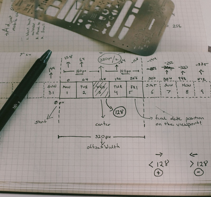
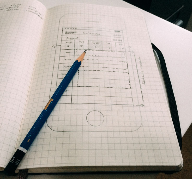
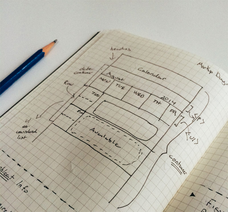
I always approach a new design with some simple sketches in my moleskin (squared) notebook. I find this pre-design stage of my process the easiest and carefree approach to creating a brand new interface. The initial design consists of a single row for displaying days for the month. Selected dates will be centered in the middle of screen. There are only 5 days displayed to the user with the center always showing the user’s selected date. Notice from the first screen that I recorded measurements for sliding the dates to the center using CSS transforms. The center image shows the final sketch that was used for creating the mockups using Sketch. The last sketch (third image) is a simple HTML markup diagram before coding up the design.
Once my sketches are complete and I have a visual guide on how to create the Calendar interface, I opened Sketch and got to work! Below are some art boards of the UI.
The first image shows the calendar design as a single row that’s scrollable. The second mockup shows the traditional calendar view that most users may be familiar with. Initially, I planned to go with the full calendar view. But I thought about giving the users the ability to toggle between both views of the calendar.
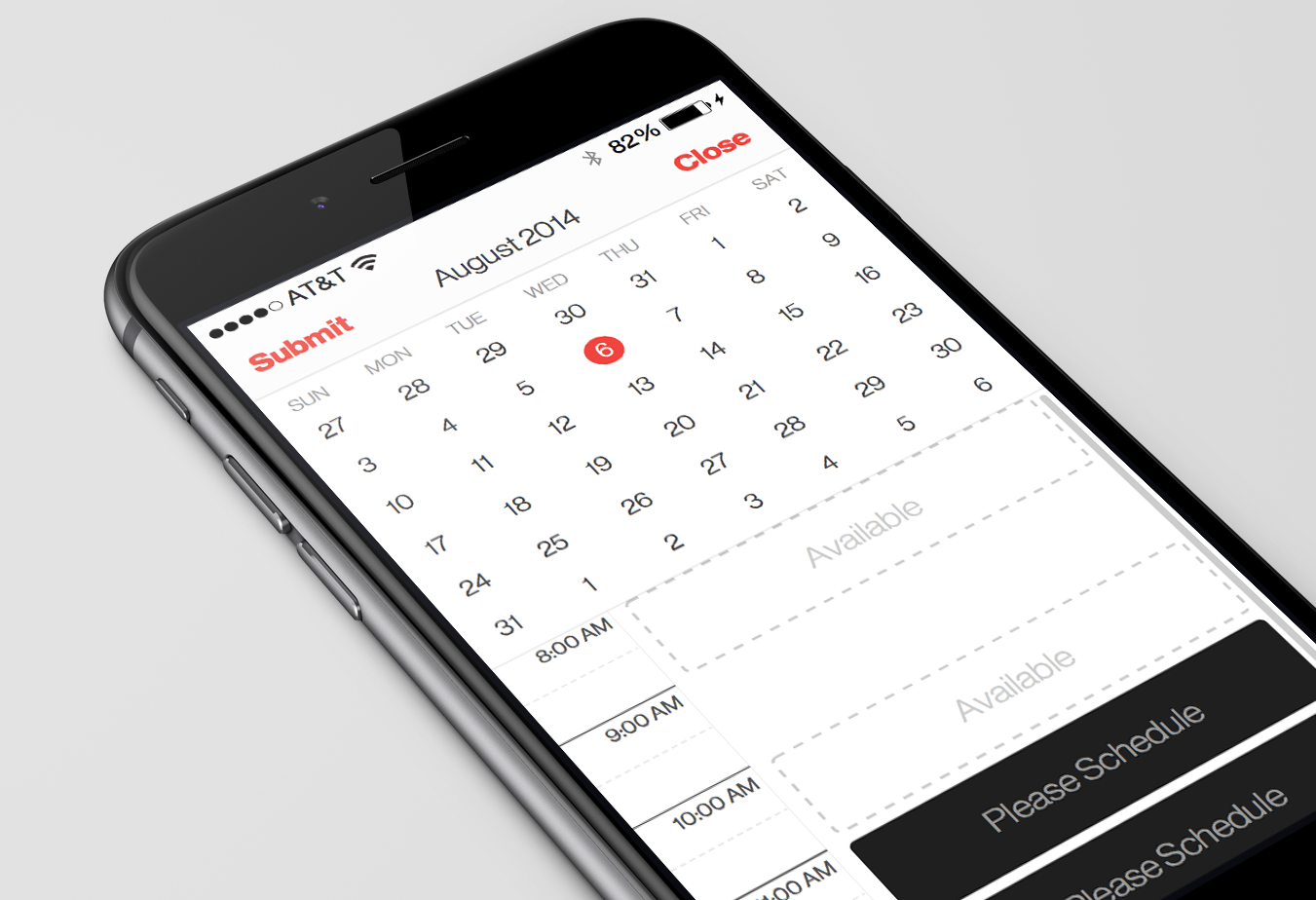
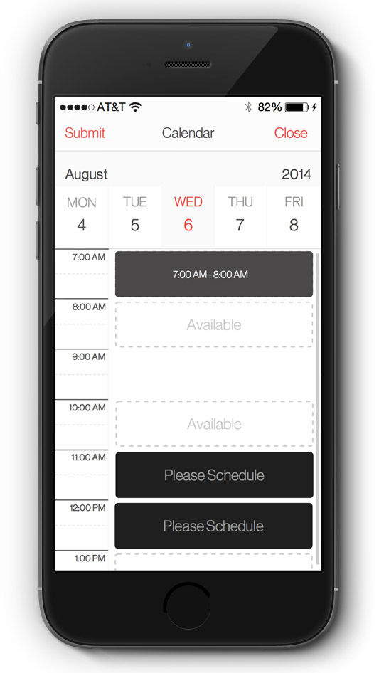
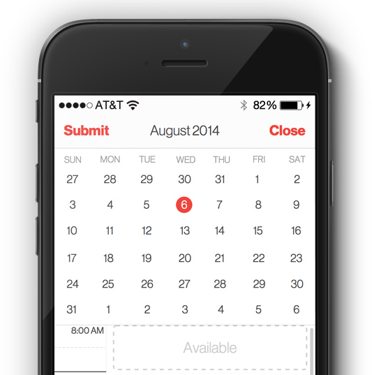
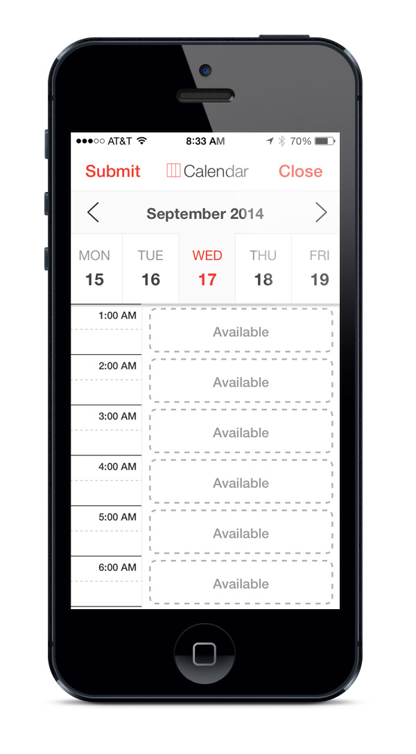
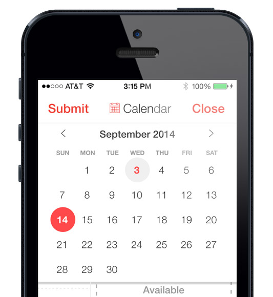
The high fidelity mockups that I created show some critical features missing in the design. The most obvious being the paginated controls to flip through each month. You’ll notice that only the month and year is displayed. This wasn’t in the screenshots until I began coding each mockup with HTML, CSS and JavaScript. Below are screenshots of the calendar in real pixels (i.e. screens created with CSS/HTML).
You can notice some subtle differences that have been made in the final design and the mockups that were created with Sketch. The font weights for “Submit” and “Close” were changed from bold to regular. You’ll notice that the full calendar required slightly smaller cells compared to the proposed mockup due to width and height constaints needed to create a perfect circle using CSS. Another small detail that has been added to the final design are the icons that sit next to the “Calendar” label. These icons are actually toggles that will allow the user to flip between the traditional calendar view and the row based calendar view.
Once the calendar and the list schedule were complete. I had to think of how the interaction will behave when a user selects an “Available” timeslot. My main objective for this project was to leave out manual input using the keyboard. For such a focused and simple task of selecting how long you want your proposed meeting to last, I wanted to leave the date entry purely touch based. So I decided to display a simple action sheet that displays a grid of 15 minute increments to help determine the duration of a user’s meeting. The default time duration for our particular project is 45 minutes. You’ll notice that we used a slight gray background and checkmark to indicate the current selection. The action button will simple state the time duration for the proposed meeting. Once the time duration has been made, the “Availabe” label will be wiped and replaced with the new meeting time. Below is real pixel screenshot of how the action sheet turned out for the final design.
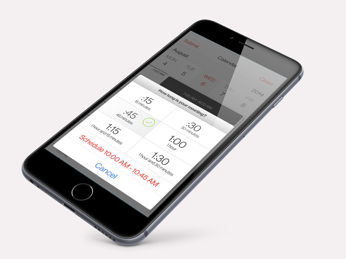
Schedule the time duration of your meeting with an action sheet.
The final piece to figure out was how the confirmation dialog for date submission would look like. I decided to integrate a list of proposed dates and times that the user selected. There could be a wide range of proposed date submissions. So I decided to insert a list view of dates that is scrollable within the confirmation action sheet. Before the user selects “Send” or “Cancel”, they can scroll through their list of dates. Once the user hits “Send” the entire calendar component is dismissed from the app. The “Cancel” button simply dismisses the action sheet and allow the user to edit their existing schedules.
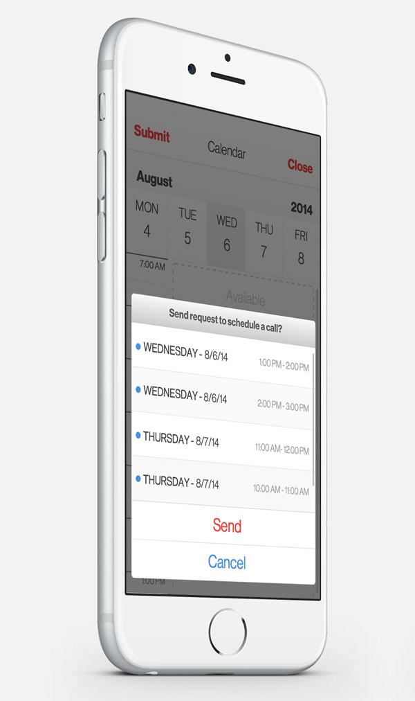
Confirmation action sheet displaying a list of propsed timeslot.
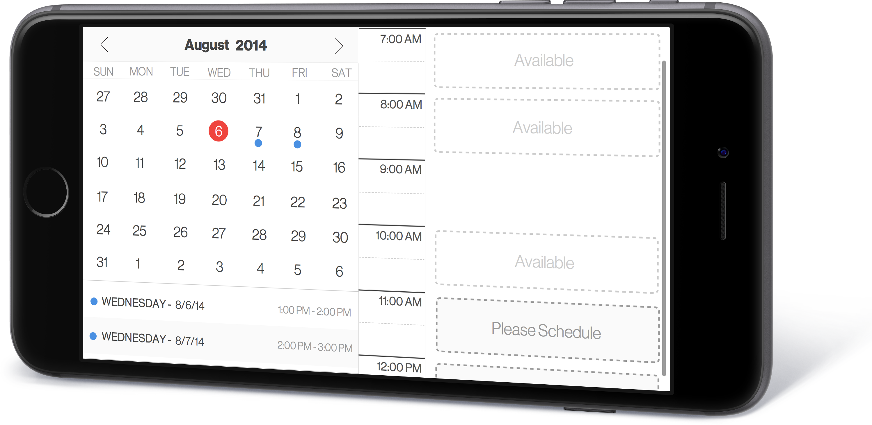
Below is a concept for how the calendar component would look like in landscape mode. Currently, the app I designed the calendar component for doesn’t support landscape mode. It strictly a portrait mode app. So I never developed the landscape version. But I wanted to show how the design would hold up. A simple 50/50 split for the full calendar and schedule list view. This would be ideal for the new iPhone 6 Plus, where the extra screen real estate would work really well this view.
Overall, I had a blast designing and developing this calendar view. I learned quite a bit about generating months and dates for forward and backward month flipping using JavaScript and CSS transitions. I utilized CSS animations and transforms for smooth backward and forward date selecting for the row based view of the calendar. Those details could go into another blog post. For now, I think this post is already too long. Maybe next time.