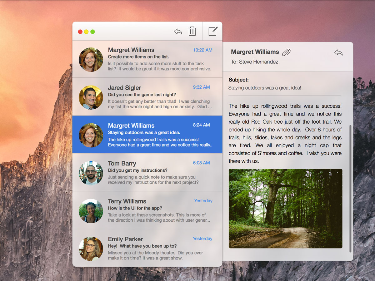

I created this quick concept while reading Apple’s marketing material on their upcoming OS X update, Yosemite. I am really excited about the new user experience that is packaged in Yosemite. It looks like a substantial update to Apple’s philosophy of UI and design experience. While viewing the marketing images of the new OS, I decided to create a quick mockup of Mail. I imagined how it would look as a compact list of message for quick consumption. A quick drawer will pop out whenever you select a message. The typeface is Helvetica Neue and the icons are from Streamline Icons. The mockup itself was created with Sketch

Simple Yosemite OS X theme for mail messages.
Shown above is how the message notification would compliment the app. Okay, I think I am done with creating Mail mockups that will never exist. It was fun to piece this together and experiment.
I wanted to re-imagine the default Mac OS X Mail App based on Bohemian Coding's Fonts.