I have been designing my own set of UI controls as my latest side project. A personalized design language or style guide that fits my personal design aesthetic. The design is still in the early stages. I do predict that it’ll change drastically in the coming weeks. But I wanted to document what I have so far and have some sort of record of my thought process. This is definitely something I’ll refer back to when I approach another project that is similar in scope.

First revision of my style guide in Sketch
When I finished the first round of revisions for my UI controls, I have to admit that there is nothing new or revolutionary. In fact, it looks a lot like some existing UIKits. The only difference is that I took great consideration into the type of colors, gradients and interaction elements to employ. I’ll list out the major pieces of the my design language and try to explain the reasoning why I have chosen a particular look and feel to a button, form input, toggle switch and dialog.
I opened Sketch and began with a simple color palate that will fit the overall look of the individual UI controls. The second item to consider is the typeface. I have always been a big fan of Proxima Nova and knew that it would be a perfect fit for my own set of UI controls. I wanted a serif typeface that will be precise and crisp. Proxima Nova fit the bill.

First revision of buttons. There are many options when it comes down to selecting a button.
How many different ways can you mold a button? They can be square and pill shaped. Or shaped somewhere in-between with a border-radius. As you can see from the screen shot, I have experimented with several different options. I have opted for the rounded corner look. I have considered the more sharped edge. But everything else in the UI kit have rounded corners. So they will probably get axed. Each button has a slight gradient and box shadow. When it comes to buttons, I have always preferred a skeuomorphic look rather than completely flat. The available colors for buttons will be white, black, red, blue and green. Each with it’s own linear gradient look.

Deciced to go with a more flat look for the input forms.
Flat will be the theme for input forms. I never liked any inner or boxed shadows for input fields. They can be a little distracting to me. A regular input box with two different types of state (active/inactive) is enough for me. Form labels will always be designated in all caps. If icons are used with labels, they should be shaded with the color red. I have no preference when it comes to label placement. They can either be outside or inside the form as shown in the figure above.

Preliminary decisions for toggles, radio buttons and checkbox.
As you can see from the figure shown above, I do like iOS 7’s toggle controls. I applied the same look to this style guide. One set of toggles are shown with a linear gradient color and On/Off labels. The second set is a more flat control with the use of color to indicate whether a toggle is turned on or off. I am leaning on including both of them in the style guide.
As for the checkbox, I opted a more customized look rather than relying on what the browser provides by default. The same goes for radio buttons. I never liked the default controls provided by the browser. Flexibility and customization always wins out for me when creating these sort of controls.

Your standard dropdown and vertical menus. I am sticking to a traditional and simple look.
With the set of vertical and drop menus I am proposing, you can’t get anymore vanilla. Menus shouldn’t be too crazy. Users expect menu items to look traditional. I kept this set minimal and clean. I plan to employ category labels in all caps and bold for the vertical layout. Everything else should be self explanatory.

Two inverted views for the navigation menu.
There is nothing flat about the navigation menu. I do like the more skeuomorphic look of nav buttons. When selected, there will be a inset applied to the button to make it look like it’s stuck in a pressed state. There will be two color options (black or white). Both colors are done in a subtle linear gradient.

Segment Buttons take a more traditional look for web apps.
The segment buttons follow the navigation menu look and feel. Simple rounded corner buttons with a linear gradient. I was going for a more app like appearance that you would find in Mac OS X.
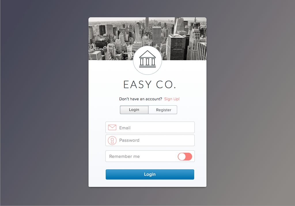
The feature image for the post is a login dialog that I created using the same controls I talked about in this post. I started to piece together layouts to see how these sets of UI controls will look like and whether it will meet my design aesthetic. So far, I like the results.
There are many other controls that I haven’t talked about (i.e. sliders, progress bars, tabs, dialogs). I just wanted to document my first set of controls before building them out. I do plan to re-visit this post and replace the screen shots with the actual controls. I sort of feel bad for showing screen shots rather than demos. But that should be coming shortly.