I am currently working on a side project that focuses on music. More specifically, an app that delivers Wikipedia entries that are specific to musicians, bands and song-writers. Before diving into code and figuring out which tools and frameworks will be utilized to build this mobile app, I spent the past week figuring out what the overall design will be like.
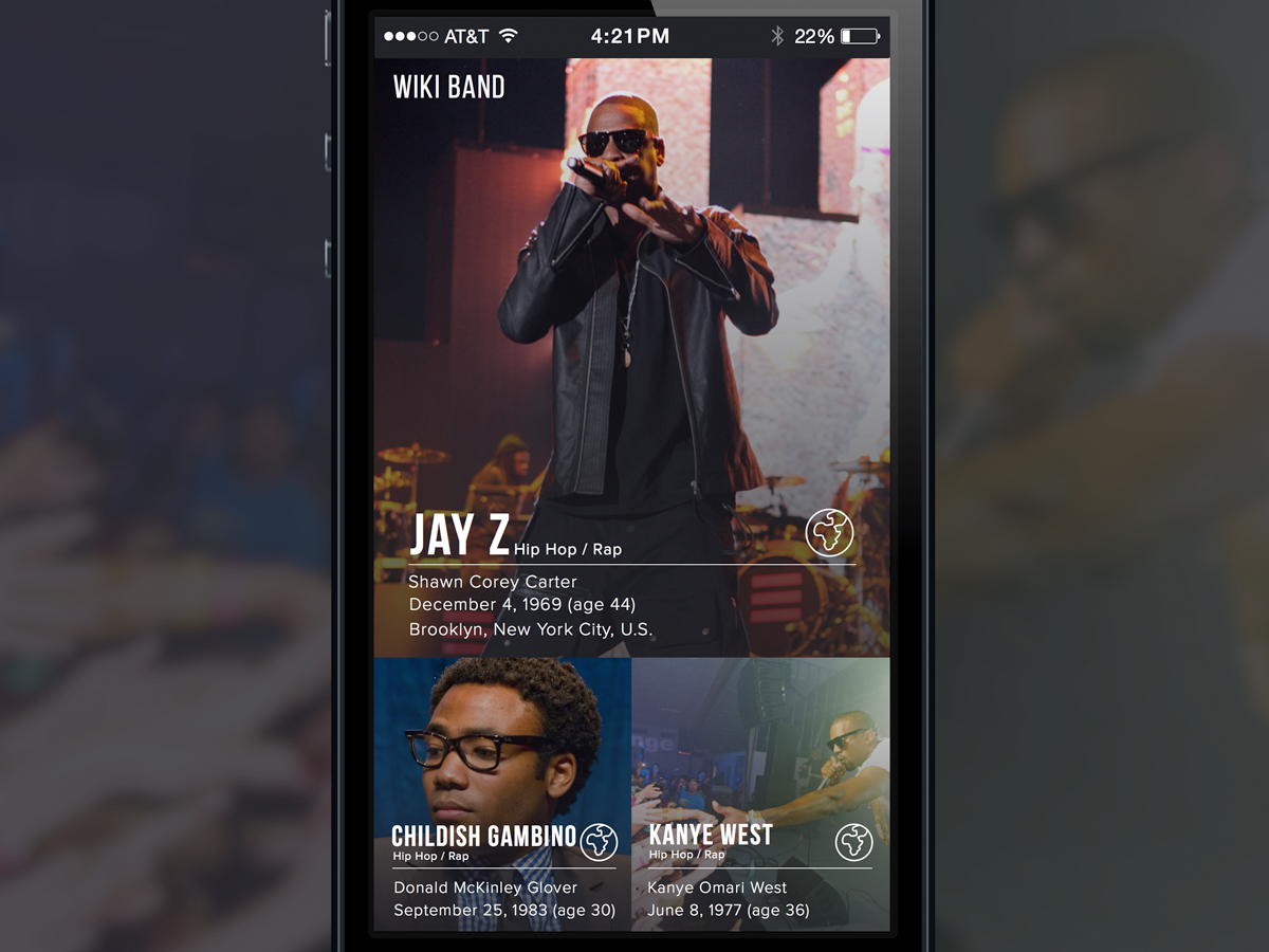
The image above shows the homepage or the main screen. A simple two row layout with full bleed images of the artists. The large images on the first row is recognized as the feature image. Below on the second row are two ancillary images. My plan is to employ image rotation that will swap artist images throughout the grid. You’ll notice that this layout will only display the name of the artist/band, full original name, date of birth or origin date of the band. The globe icon will is an external link that will lead you to their Wikipedia entry. All images displayed the app will be directly from Wikipedia.
Below are three different layouts to reveal the band and artist detail information. Each has it’s unique way of displaying information. There are only two typefaces being used. The main titles and logo are using Bebas Neue. All body copy is using Proxima Nova. The icon set shown are from streamline

First purposed layout featuring Jay Z. Full bleed image with overlay gradient.
The layout with Jay Z is probably my favorite one. The layout calls for a large font size for the artist’s name. Underneath the name will be either the occupation of the artist or the genre of music the artist/band is categorized in. You will notice two icons (musical note and globe) located on the right-hand side of the title. The musical icon will display a modal with links to several music services (i.e. iTunes) to find the artist’s music. The globe will take the user directly to their wikipedia entry. The layout is optimized for quick/skim reading. I don’t necessarily expect the user to read everything on screen. They may just be interested in the imagery or the quick stats that include born, origin dates and occupation. The lower tier of the layout will comprise of the full wikipedia entry.

Rose tinted color layout featuring Childish Gambino.
The layout displaying Donald Glover’s wikipedia entry is more colorful and bold. The overlay color makes it difficult to read. But it can be improved by raising the alpha channel of the color. The layout is very similar to the first revision shown above. Different opacity values help the readability of the copy for each section of the page.

Third details layout feature.
Kanye’s layout is a little more generic and minimalist. The layout utilizes an all white background to give it a clean look. Again, maximizing the ease of scanning text is the central theme. Users will not read the majority of the text on the app. I believe the user base will more likely be interested in the small tidbits that are displayed below the artist’s name. The musical note will be the highlight of the page. Hopefully users will click the link and be re-directed to the artist or band’s playlist. The playlist will be served pending on the available musical services.

Wikiband in landscape mode.
I wanted to consider the possibility of showing a different view of the homepage when in landscape mode. I think a transformation from a the proposed layout to a complete grid view would be interesting to the user and help keep them engaged. Displaying more artist will keep users from leaving the app and encourage exploration. Overall, the main goal of the app is to provide useful information of their favorite bands on their phone. Hopefully it will be visually appealing and make an emotional connection. We want users to come back!
Some initial thoughts of some obstacles and design decisions when creating a new set of web UI controls.