There are many ways to construct your navigation for mobile apps. Especially for iOS apps that target the iPhone. Tablets/iPads will be ruled out of the discussion for this post. When the first generation of iPhone apps exploded on to the scene, many adopted Apple’s Tab Bar located at the bottom of the screen. This seem to be the perfect solution for allowing users to seamlessly switch between different views of an app. It has become the standard for implementing app navigation for the 1st generation of iOS apps. That was until the world was introduced to Side Drawer Navigation (slide/drawer). Side Drawer navigation was popularized by Facebook, Path and Gmail iOS. This new navigation pattern was adopted by many app developers.
Many mobile web application and responsive web pages use this particular pattern with varying degrees of success instead of the traditional drop down menu. Many libraries are currently available that will help developers implement this navigation pattern in their own apps without much friction. But I want to point out in this post that old trends shouldn’t be ignored. Sometimes, those older patterns may end up being the better solution. Below, I would like to discuss these two types of navigation patterns for a project that I am currently working on.

Two different designs. One uses the traditional tab bar and the other the sidebar.
I designed two different layouts for an iOS app called Event Picasso. The first layout with the red navigation bar and status bar uses the traditional tab bar located at the bottom view. The tab bar only provides 5 options for the user as compared to displaying the entire list of menu options that the SideBar pattern can provide. The more button follows the familiar pattern of displaying the rest of the menu options in a separate view.
The benefit of using a tab bar for navigation is that it will always contain contextual information that tell users where they are. No time will be wasted in determining which page they are on. A simple glance at the bottom of the screen will notify them instantly which page they are viewing. It’s more effective than glancing at the navigation bar looking for the page title. I also believe the nav bar provides less friction in the UI. Screens aren’t being swapped just to show you a menu list of items. If you want to see the Dashboard, just tab the button. You will arrive at your destination instantaneously.

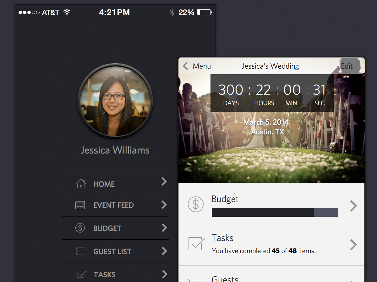
Different view of the slide out menu pattern for iOS 7.
The Side Drawer is one of the more commonly used patterns and has worked well in iOS 6 and earlier. This is mainly due to the fact that the status bar was always fixed and isolated from the rest of the app. Unfortunately, iOS 7 has changed how the status bar is positioned on the screen. The status bar is no longer it’s own entity. It is now overlaid on top of the main screen itself. That means the current Side Drawer implementation will expose a weird visual cue on the status bar background. Three-quarters of the status bar will be highlighted with the menu screen background.
There are several ways to avoid this unwanted annoyance. My favorite, and one that I have adopted for my final design is to apply a zoom transition that is seen in iOS 7’s app switcher. When a user selects the menu control, instead of sliding the contents off screen, shrink the app view itself and expose the menu items that are hidden underneath. A screen shot is shown above to demonstrate this concept. Another easy solution is to just allow the status bar to slide out with the main view page itself. But I am definitely going with the shrink view option.
This is my own personal take on how an iOS Mail Client App should look like.