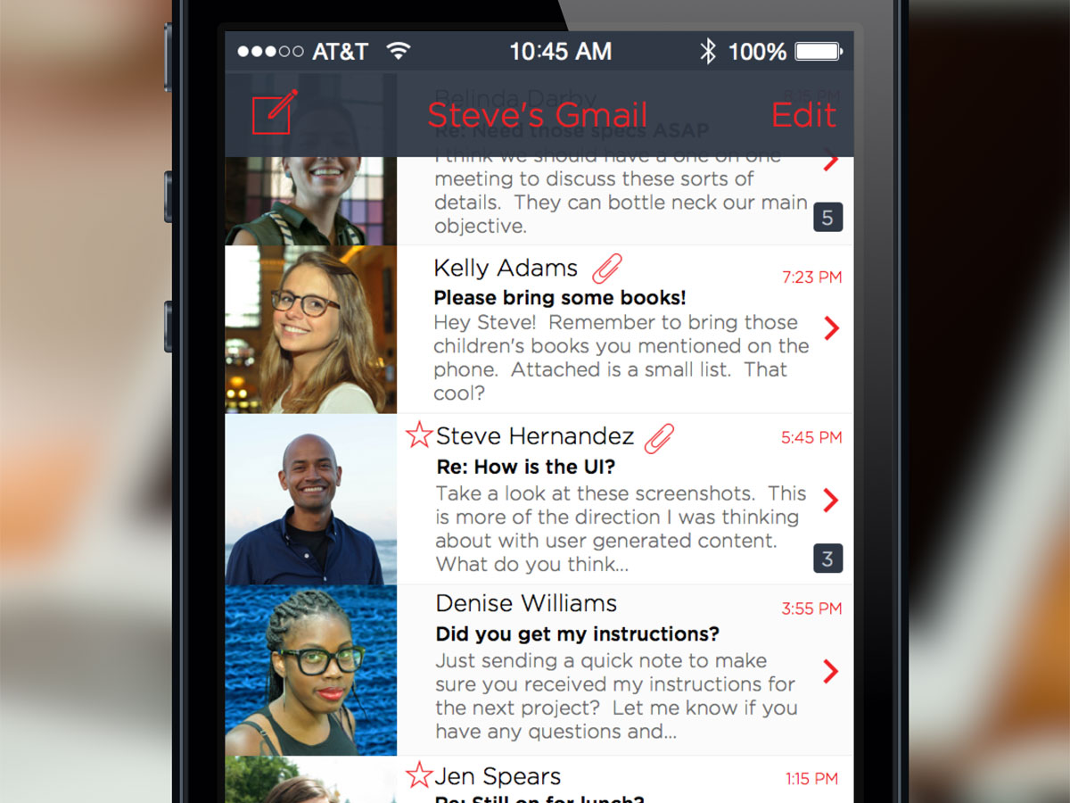
I spent this weekend mocking up an email client app for iOS. I think it turned out a little interesting. My intention was to focus on creating a more personal and engaging email client. My attempt to make it more personal revolves around actual images with the people you correspond with on a daily basis. That’s why there is a large avatar photo of the user’s contacts. More modern day email clients tend to use circular images for avatars or rounded corners. I was more or less going for a full bleed image view. Your typical controls can be found on the main view (i.e. edit, threaded counter, paperclip for attachments). Where this particular design differs from others is the introduction of the tab bar for your menu controls rather than a traditional slide out.

Traditional tab bar design pattern with extended Inboxes control.
When Tapbots released thier new iOS 7app, one of the features that surprised me was the ability to hold down one of the tab buttons and choose a new section or view. I thought this new design pattern could be utilized on other popular apps. I thought it would work great with an email app. I didn’t stop at the Inbox summary screen. I thought about how I would like to view my VIP(s) contacts. Below is a concept that I came up with based around a traditional contacts view.

Treat your most important contacts like an address book.
The VIP contacts view only serves two purposes. Show the list of emails that contact has sent you and their contact information (i.e. name, address, email or telephone). The option to open a new dialog for a new email message is available on the top-right of the navigation bar. Selecting that control will display an empty email message with the address of your contact.

More traditional view for creating a new email.
For the message view, I left it pretty much conventional. Nothing crazy or out of the ordinary. I just wanted to make sure the design of the message view stayed consistent with the other two mockups. The only thing that might stand out is the toolbar. It suppose to float at the bottom of the view and never be anchored to the edge. I tried to keep the color palatte consistent through out the app.

Alternate view of iOS Mail.
This design is definitely a work in progress. I’ll start fleshing out more screens when I get some free time. Stay tuned for more changes.
Boilerplate for prototyping websites
Simple tool for prototyping websites or fleshing out new ideas with some cutting edge front-end tools.