I just recently put together a boilerplate web application that utilizes the Express web framework via node.js. I have been using this boilerplate to jumpstart my own web projects. Whenever I need to create a quick prototype or scratch an itch about an idea, I start coding within this template. You can find the project on my github account. I named the project [WebPrototype] (https://github.com/slhernandez/WebPrototype).
WebPrototype’s greatest feature is it’s use of grunt.js. Grunt.js is a JavaScript task runner that is similar to Ruby’s Rake. Grunt.js allows you to automate tasks like code minification, linting, SASS compilation and much more. The ecosystem for Grunt is remarkable and that alone has made it my favorite toolset for building anything for front-end. For this particular project, I use Grunt.js for compiling and watching SASS files, generate responsive images and copying those responsive images to their destination folders for website consumption. I kept this grunt.js setup simple because the list of tasks that I usually populate it with can get overwhelming. I plan to insert contrib-jshint and grunt-contrib-uglify for minifying files with UglifyJS in the near future.
Besides Grunt.js there are many other great technologies included in this template that I like to use when working with front-end projects. One in particular that makes prototyping very easy to deploy to the web is [The Express web framework] (http://expressjs.com). Express is built on top of Connect, and provides structure that makes writing web applications easier. This includes allowing you to use any template engine you want, such as Embedded JavaScript EJS, utilities for responding to various data formats, routing URLs, and transferring files. Express has the philosophy that applications vary in their requirements and thus should be lightweight to allow you to craft exactly what you need and nothing more. In this case, we just need a minimum viable framework to create prototype websites. Websites that are for proof of concepts and ready for rabid iteration.
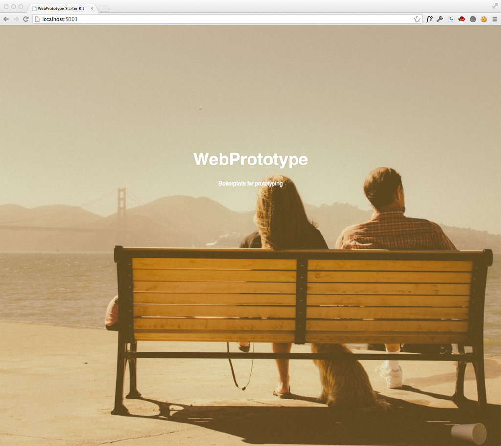
If you decide to use WebPrototype you will notice the background image of a couple sitting on a bench viewing the Golden Gate Bridge. First of all, the image is from Unsplash. A great resource if you ever need hi-resolution photos for your design projects. The images on the site are FREE (do whatever you want). The purpose of the image is to demonstrate the tool’s capability of serving different image sizes for responsive web design. Thanks to Andi Smith’s grunt-responsive-images and Scott Jehl’s picturefill, WebPrototype can generate multi-resolution images for srcset or PictureFill’s polyfill solution. I personally always use PictureFill to swap out different image sizes for mobile devices. Everything is setup for generating three different image sizes (small, medium, and large). Just dump all of your images into the src/assets/img folder and run grunt from the command line. Your images will be generated in three different sizes thanks to grunt-responsive-images and ImageMagick. The background image on WebPrototype is swapped out in three different sizes thanks to media queries. If your website relies on the use of heavy images, PictureFill and responsive images is a must have for your website.
This post has gotten a little too long for my taste. So I’ll end it with a list of great toolsets that WebPrototype includes.
Grunt.js - Task runner for performing repetitive tasks like manification, JSHint, multi-resolution images, SASS compilation.
SASS - Pre-processing stylesheets that allow variables, mixins, and CSS inheritance.
Normalize-css - CSS file that makes browsers render all elements more consistently and in line with modern standards.
Prefix-free - Break free from CSS prefix hell by Lea Verou
Express.js - Node.js web application framework.
Underscore.js - Utility-belt library for JavaScript.
jQuery - Abstraction layer and toolkit for working with the DOM.
Embedded JavaScript EJS - Templating markup tool.
Responsive Images - Grunt-responsive-images for producing images at different sizes for mobile devices.
PictureFill - Responsive images approach that can be used today to mimic the proposed picture element.
Some quick thoughts on my design process. How do I take an idea in my head to something that's real and usable.