
I thought it might be helpful to describe my design process when approaching a new project. This may prove to be useful to me later in the future to see how I have changed over the years. I’ll just touch on high level areas without going into too much detail. I’ll probably expand on some of these ideas in another blog post.
First of all, I tend to collect a lot of screen shots of my favorite designs found on the web. I mainly do this for ideas and inspiration. I use Ember from Real Mac Software to organize all my images. So my catalog is quite extensive. It’s a great starting point when gathering new ideas for a client or to jump start a new project. It’s important to me that I expose myself to good design. Those designs could be from Dribbble, Behance or Designer News. I am always looking for great ideas and interesting layouts that strike an emotional cord with me.
I tend to focus on the three most important features for an app (mobile or web) and figure out how to bring them to the forefront of a design. I try my best to make sure that these main features are the focal point. Then I get rid of any clutter that may confuse or distract the user. I also like to emphasize on the importance of that “one” feature that is suppose to separate our app from the competition. But I always keep the user in mind and respect their web or mobile knowledge. Not to mention the time they take to use your product. I try to anticipate the needs of my users.
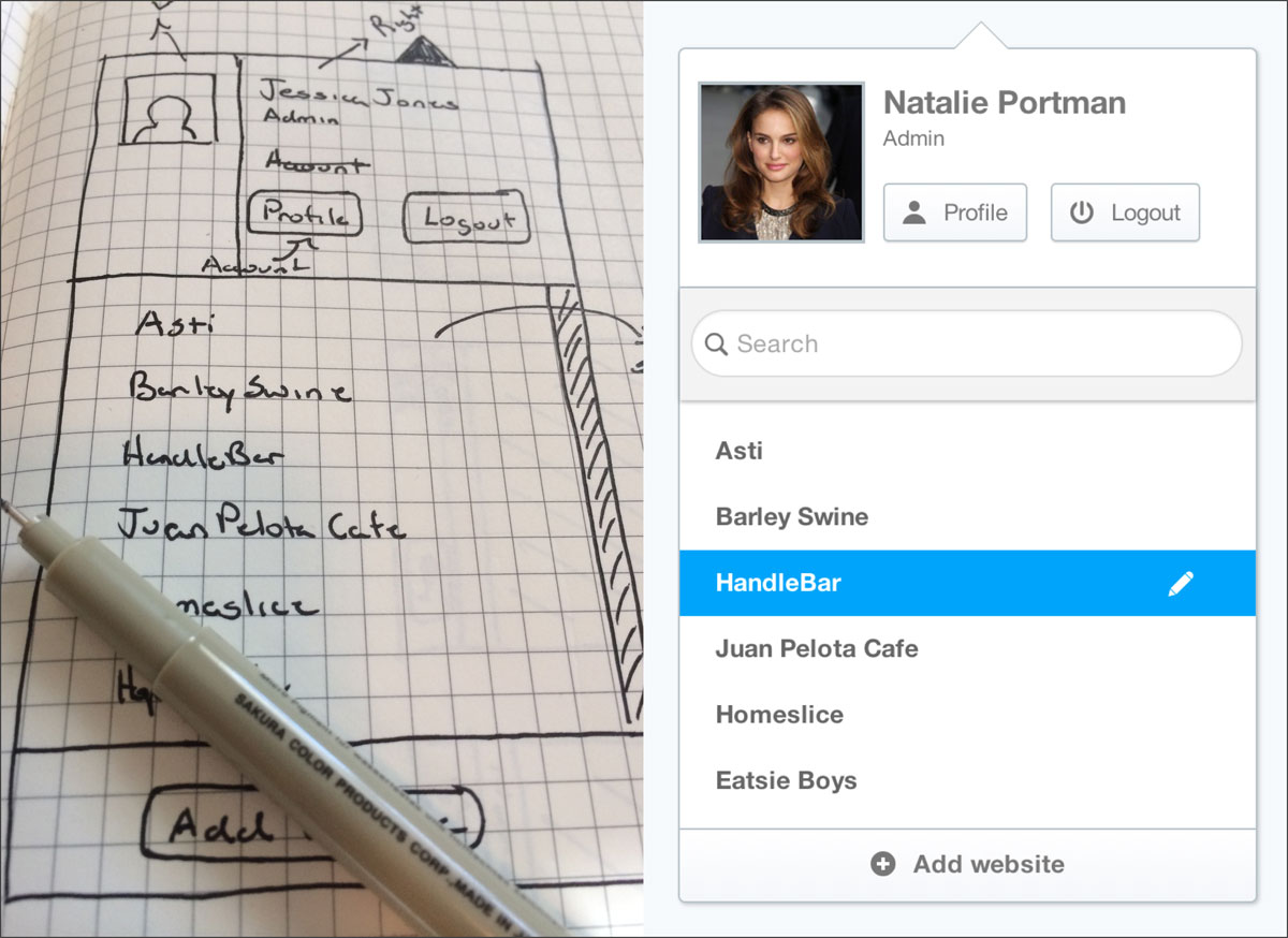
I then begin to sketch out my ideas using a pencil and grid paper. I iterate through several ideas and eventually something comes out that makes sense usability wise. I live and breath the internet and I am also a very obsessive iPhone user. So I pretty much know a lot of design patterns that are very common today. That could be web layouts (header, navigation, body, footer) or mobile layouts (side menus, drawers, interactive touch). At the end of the day, it has to be something I believe users are very familiar with. I don’t go to the extreme when designing layouts. I stick to themes that other successful designers have used in the past. I am very conservative in this approach.

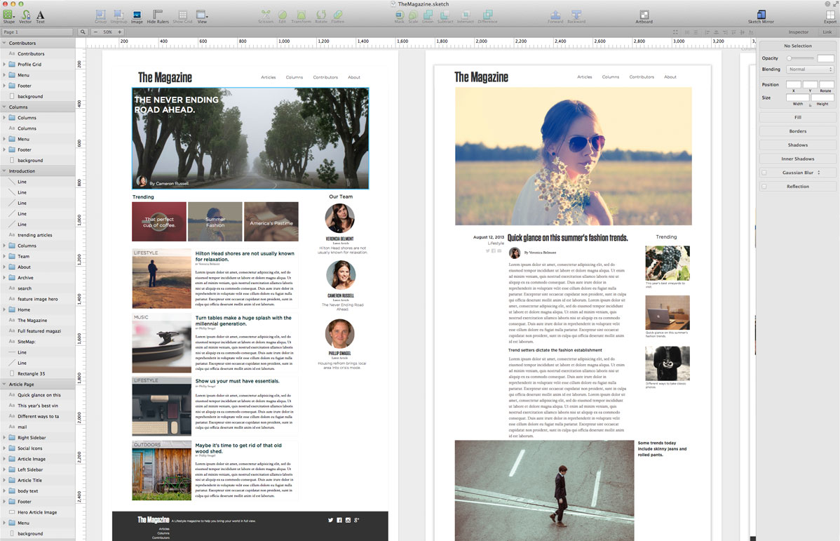
Sketch is my favorite tool for creating user interfaces and web designs.
Then I start mocking up the designs with Sketch (App). Sketch is such a joy to use. It’s so easy to create anything you can imagine. I love how I can use Artboards to create a mini storyboard layouts for an app. Then use the Sketch Mirror iPhone and iPad app to get a preview of how the design will look on an actual device. The most important step in my process is trying to mock a design that will engage users emotionally. Many times for me it’s images that help bring a theme to the overall purpose of the app (mobile or web). Other times it’s great typography that help deliver your message if working with large bodies of text.

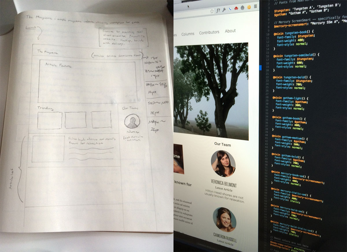
Bring your ideas to life with code.
Then I dive into code and start prototyping. That could be HTML, CSS, and JavaScript for web development or firing up Xcode and getting into Objective-C. Then this whole process becomes a beast of it’s own. I must stress that getting a mockup into real pixels quickly to experiment the interactions of a design is very important. It’s not real to me unless my design is fleshed out in HTML, CSS and JavaScript. This last step is very important. In the end you want your idea to be a living and breathing thing you can now take care of and show off to your customers.
Another design exercise. This is my attempt to visualize a movie player app for the web.