When designing a web app, either for desktop or mobile, you have to think about the mobile devices and desktop browsers that will display them. Do you build separate web applications to address both mobile and desktop? Or rely on responsive web design to transition your desktop interface into a mobile solution to fit all mobile devices?
Web development has evolved into a discipline to write once and run everywhere. I don’t believe in having two separate solutions to address mobile and desktop characteristics. But some teams have gone the native route for their mobile solution and have a corresponding open web solution for desktop. That’s a fine decision if you have a large team with the necessary skill set. On smaller teams, with a web centric skill set, a responsive web solution is your best bet. That’s the path I have chosen for a scheduling project I am working on.
Below is a video of my solution in action. I typically use responsive web design to transform a desktop app into one that is optimized for mobile.
There are pros and cons to this solution. For instance, you have one single code base to manage both views. An example might be a shared controller to dictate actions. This particular app was written with Angular JS 1.4. We built this app with a shared schedule controller.
The downside for this approach is there are two distinct views. Two HTML files that have to be maintained because both the desktop and mobile views are drastically different. You also have to account the amount of CSS styles devoted to the solution. I use the CSS preprocessor Less to organize my styles. That means their are two files devoted to my style markup for desktop and mobile. All of a sudden you need to maintain two different UI views for the life of your application. But this solution is a little bit better than having a native solution written for iOS or Android. The development costs are much cheaper.

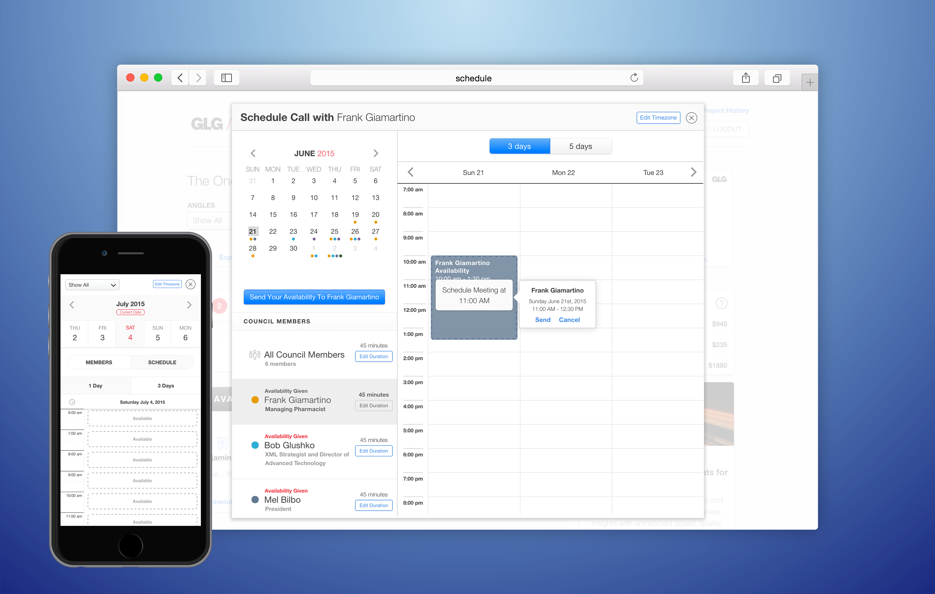
Desktop view of calendar.
The above image shows how dramatically different the desktop view of my design is compared to its mobile counter part. It’s more feature rich and complex. It supports dragging for selecting time slots (i.e. hours for availability). A mini-calendar has been integrated to facilitate day, week and month navigation. Color indicators have been included to inform the user that content exists for viewing. A feature that is considered to be valuable to my stake holders is list of council members. You will notice a list of names located on the left-hand side. There are many visual indicators that give information to the user on it’s current status. Most of these items need to be represented for mobile.

Mobile view of my calendar design.
I am not going to discuss why I have selected the mobile layout shown in the image above. It’s only a compact version of the desktop layout. What I want to discuss is the advantages and disadvantages of selecting this particular solution to address mobile options in regards to your web application.
There has been a huge shift the past five years on how people have grown addicted to their phones. It has become clear that smartphone users spend the bulk of their time in mobile apps instead of the open web. Users expect a familiar mobile experience that native apps provide them. So my approach for my schedule app is to provide a native like experience using responsive web design principles. Media queries are setup to completely transform the markup, and sometimes replace it, to provide a native mobile experience. The benefits is a streamline and simple mobile experience. The downside is extra HTML markup and a whole slew of CSS styles that is very specific to the mobile solution. This makes development and maintenance tedious. Any feature that is added to the desktop view needs an update to mobile view. You have to make a decision which view takes precedence. I am sure google analytics can help with that decision.
You still have to pay the development costs of maintaining two different UI views. Even if the code base is shared to some extent. When developing a new web application, you have to take into consideration your mobile solution. That means, even when using media queries, there will always be two stories to tell. Each story has their own costs (i.e. coding, UX, features, gestures and user base). Why did I include user base as a cost? Because we consume software very differently whether it’s from the open web or your mobile phone. We have certain expectations that must be met for each unique platform.
Implementing a playful image bounce with expansion and blur.
Twitter's iOS App has a nice pull down animation with the profile's header image. I attempt to re-create it for WikiBand.