Implementing a playful image bounce with expansion and blur.
Warning: This is not a step by step tutorial on how I integrated an image header expansion and blur effect. Rather, it’s how I took an existing solution written in Swift, and modified it to fit my personal needs.
Recently, I discovered Twitter’s iOS app. Being a heavy and loyal user of Tweetbot by Tapbots, I never installed this app. But I am so glad I gave it a try after reading Brian Lovin’s “Design Details: Twitter for iOS”. While exploring the user experience and subtle animations sprinkled throughout the app I found the playful image bounce with a user’s profile image. I immediately knew I wanted this delightful animation for WikiBand. My current hobby project. Below is the final result.
I had a ton of help from the internet to piece this solution together for my personal app. The most important piece of information came from the wonderful folks at Think & Build. They have an article titled “Implementing the Twitter iOS App UI” that was critical to jump starting my own version of this animated feature.
Before diving into some details on how I tooks some important bits of code and insight from Think & Build’s solution, I want to mention the design of this view. This will not be the final layout for the details view. In fact, this view looks very much like the Twitter profile page. This little demo is just an exploration exercise.
Applying FXBlurView
Think & Build built their demo with Swift. You can clone their demo from Github TB_TwitterUI. WikiBand still uses Objective-C. So I needed to translate the whole demo from Swift into Objective-C. The process was straight forward with the exception of FXBlurView. FXBlurView is a UIView subclass that the project uses to apply a realtime background blur effect. It works wonderfully when implemented correctly. From the demo shown in the video loop, you can see the header gets an applied blur effect with the name of the artist appearing in the center. Swift has it’s own unique way of applying third party subclasses. FXBlurView can act primarily as an extension to UIImage using the method blurredImageWithRadius. The main difference is that Swift extensions don’t have to be named. This became a unforeseen roadblock for me when trying to re-write the demo from Swift to Objective-C. I had no idea that what was required was a brand new custom class that extends UIImage using the following syntax in both .h and .m files.
@interface UIImage (Extensions)
- (UIImage *)blurredImageWithRadius:(CGFloat)radius
      iterations:(NSUInteger)iterations
      tintColor:(UIColor *)tintColor;
@end

@implementation UIImage (Extensions)
- (UIImage *)blurredImageWithRadius:(CGFloat)radius
      iterations:(NSUInteger)iterations
      tintColor:(UIColor *)tintColor {
      ...
    }
@end
So after copying both FXBlurView.h and FXBlurView.m from the author’s github repo into my WikiBand project, I created a custom UIImage (Extensions) class. I renamed both the .h and .m file to UIImage+FXBlurImage.h and UIImage+FXBlurImage.m and added the blurredImageWithRadius definition and declaration for use in my own UIImage objects.
Below is a snippet of code that demonstrates how I utilized the blurredImageWithRadius.
Autolayout Madness
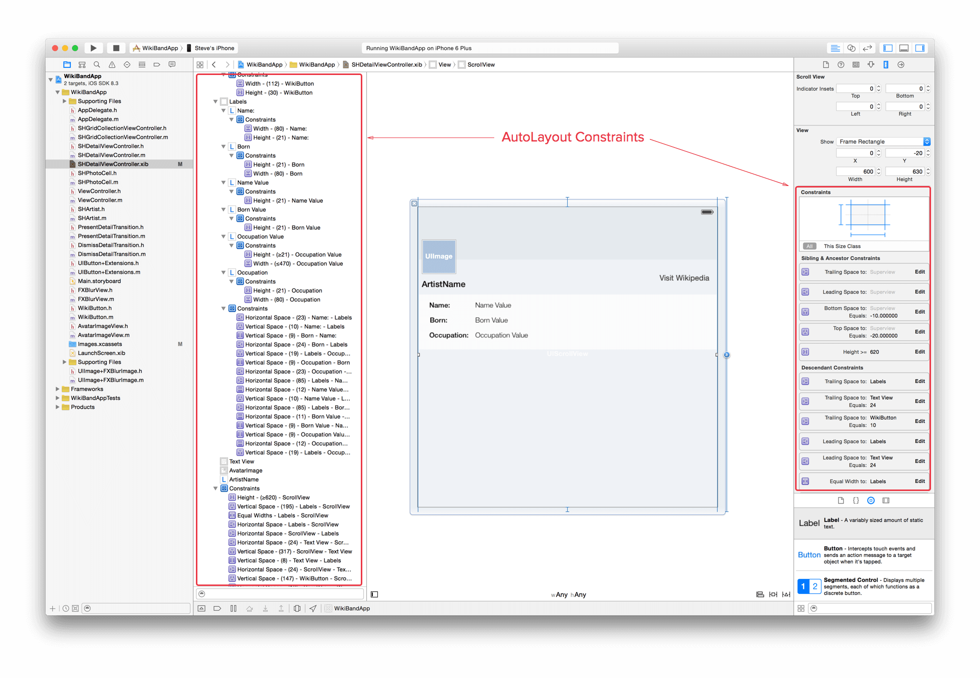
The final piece of applying this cool animation effect to my details view is Autolayout. The amount of effort that was spent to apply the necessary layout attributes to every UIView on the view was painful. If you don’t have your UIScrollView and HeaderView (i.e. UIView) setup properly, no amount of Core Animation code will trigger the nice image bounce you setup with scrollViewDidScroll. When building customized User Interfaces in iOS, everything starts and ends with Autolayout. Below is a screen shot of WikiBand’s AutoLayout constraints.

WikiBand's AutoLayout constraints for the details view.
The constraints for this view was a bit overwhelming for me. But it was a necessary to get any sort of animation to trigger properly. Especially if you want the header image to stick to the top of the view when dragging your view downward. It makes a big difference on how you order your views. I had to apply my own custom constraints to any new UIView element introduced to the screen. For this layout to be responsive and fluid across mulitple iOS devices, every item needed to have the appropriate constraint in relation to their neighboring UIViews. Once you have your constraints layed out appropriately, without any constraint errors, your view layers can be manipulated by Core Animation and scrollViewDidScroll correctly.
I learned that iOS code samples only provide part of the story. You have to dig into how the author structured their AutoLayout constraints in Interface Builder to get the full picture.