The concept for this app design is specifically for iOS. I use the iPhone as my primary phone. So, my bias and heart is entrenched in the Apple mobile eco-system. In fact, as a designer of mobile and open web apps, Apple design is very influential to my work. With that said, the Apple Music app was my inspiration for this design. This turned out to be an interesting design exercise for a friend. I wanted to share some thoughts as I pieced this layout together.
As a designer, I have many weaknesses. One of them has to do with creating unique layouts for easy information gathering and image placement. It’s sometimes hard for me to come up with something unique when it comes to defining a particular aesthetic for a design. But with practice, it will become easier in the future. With that in mind, small iterations and changes to successful and known design paradigms is how I can ensure an adequate design to ensure an apps usefulness to users.
The fonts used for this design is Apple’s very own San Francisco. You can download the fonts from Apple’s developer website. I highly recommend the WWDC video “Introducing San Francisco”.
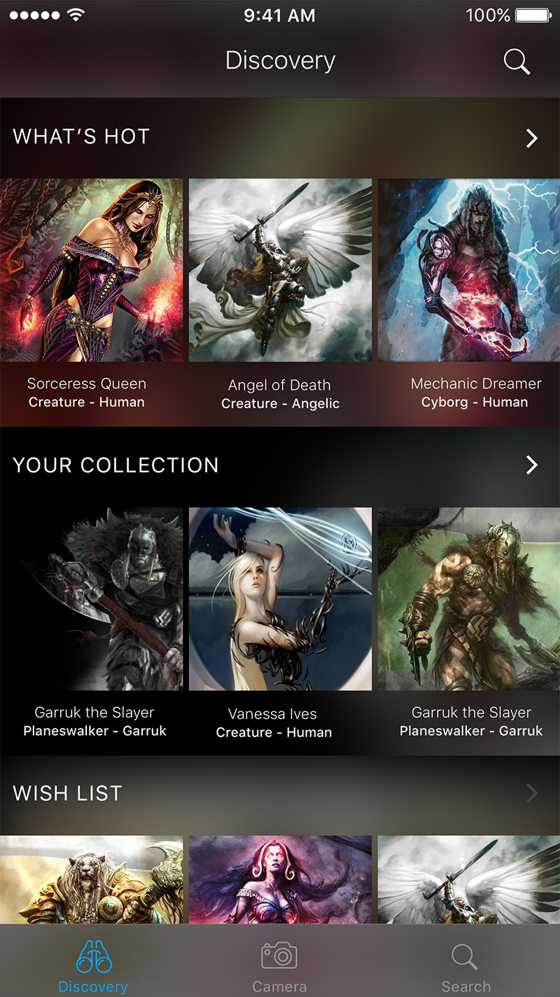
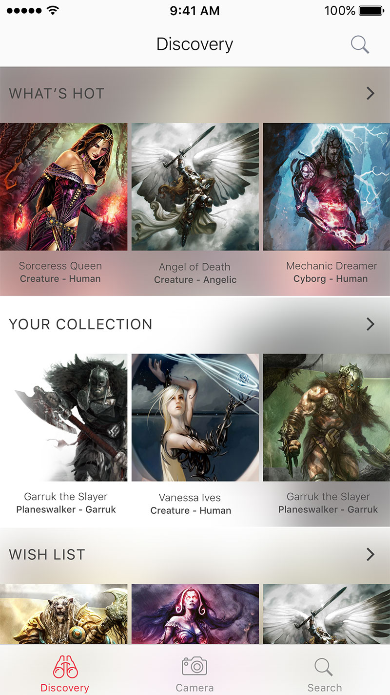
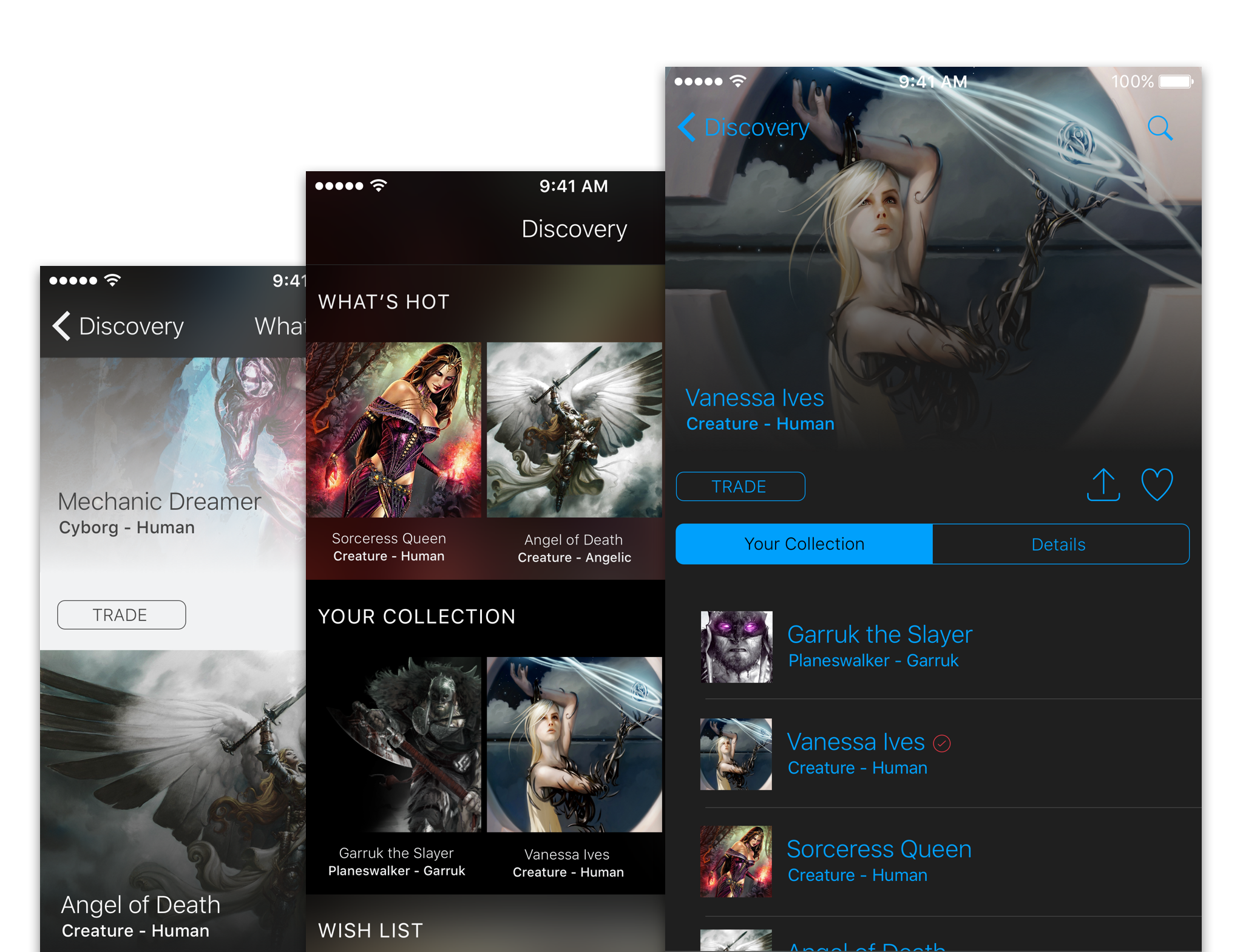
I would consider the Discovery to be the main page. This is what the user will encounter upon opening the app. The purpose is to allow the user to explore characters or cards they may never encounter. The app would be better served if the price for each card was displayed. But I thought it would be too much of a distraction. I want users to explore cards based on categories they generated. For the Discovery view a simple grid of 3 items for each row will show each character in a category (i.e. What’s Hot, Your Collection, Wish List). The categories can either be generated by the user or come with the app pre-packaged.
I created two themes (dark or light). Both offer a great contrast and may be an option for the user to switch between the two. Again, doing two different themes was more of an exercise to determine colors, fonts and layout. Just an exploration in app design visualization.
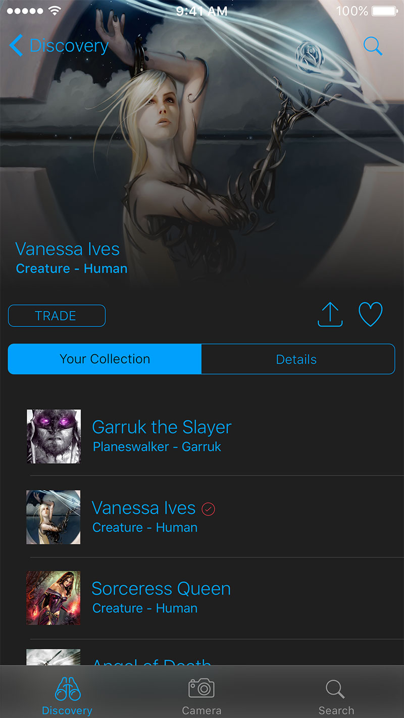
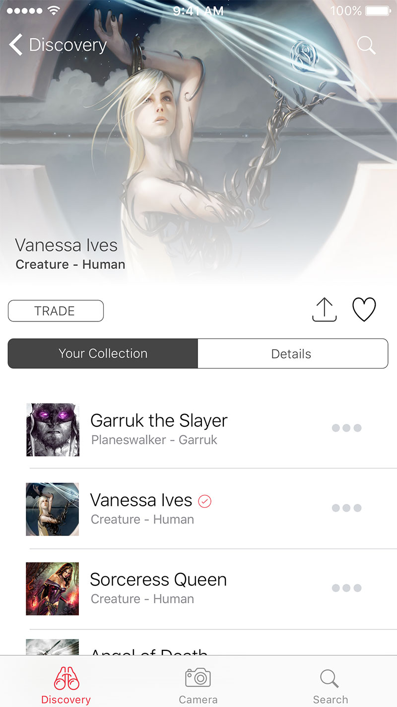
The Discovery Details view is a simple list of characters that belong to a particular category. The mockups shown above display a list of characters in the “Your Collection” category. There are two sections to this view. A hero image is displayed based on who was selected on the second section (table list control). The tab controller gives the option of viewing the list of characters within the collection or full details of the character selected on the list. I have never considered this type of UX flow when piecing the layout together. Right now, I think it may be too clunky. Maybe even annoying. I can’t make a firm judgement until I create a quick prototype using Storyboards and actually test the interaction on either the iOS simulator or iPhone. Just above the tab control is three buttons that make up the toolbar for the character selected. Simple controls to drive a trade option (not really thought out), standard share button and like button.
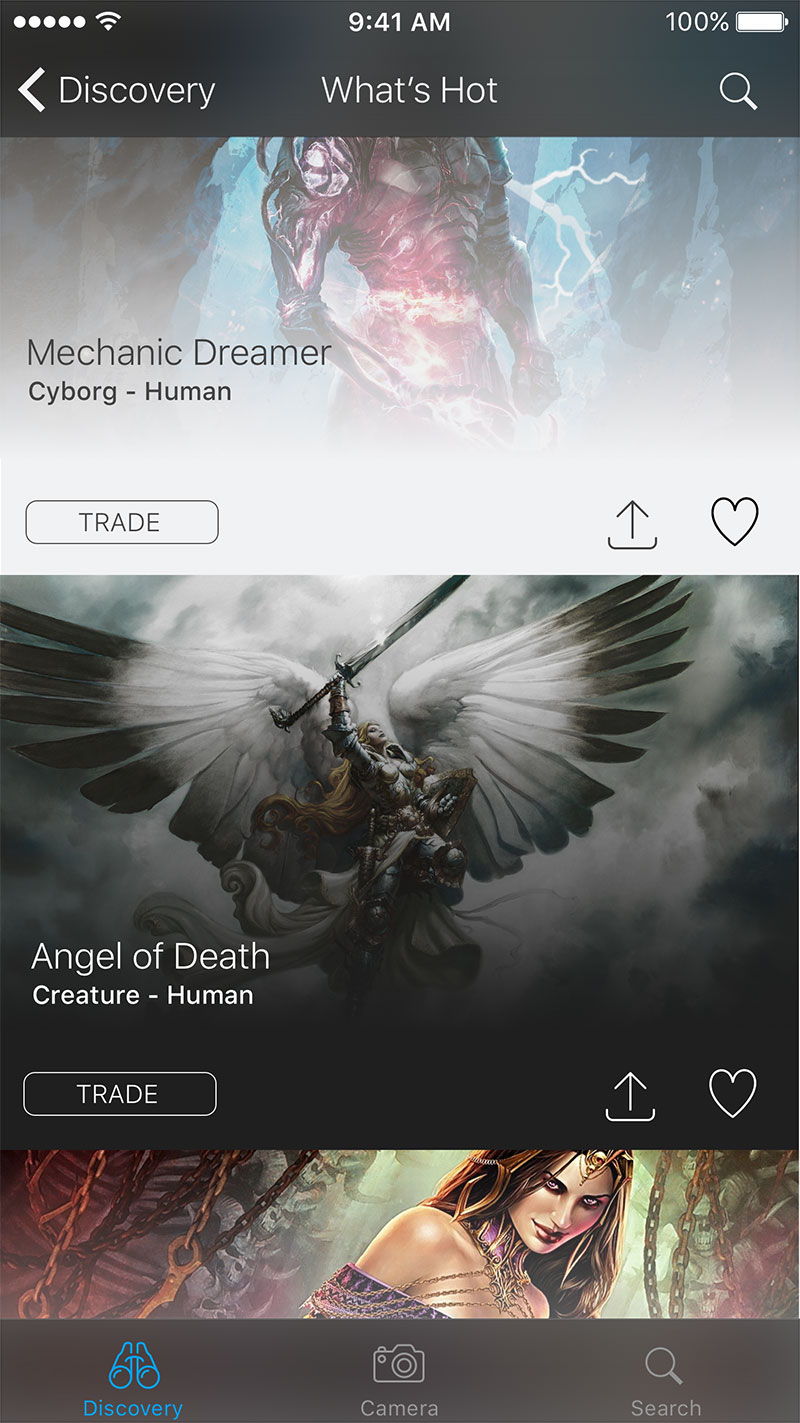
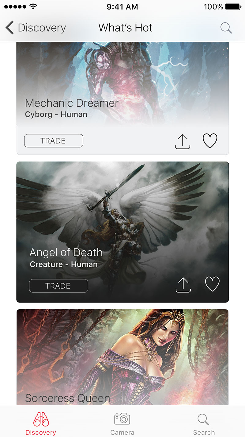
The third set of views takes a more popular card approach. The dark version shows a more full bleed (full width) approach. The light version displays traditional cards that I think gives a more tidy and organized layout for exploring a list of characters. Just like the Discovery Details view, a toolbar is inserted for every character card to allow users to quickly trigger a trade, share or like. Ideally, selecting like will filter the character to the “Your Collection” category. Both “What’s Hot” and “Discovery Details” are two separate approaches for showing essentially the same data.
The exercise hasn’t been thought out in detail. These are just mockups that have been given to a friend who has asked how an idea might look like visually. I thought it would be interesting to post this on my blog so that I may reflect on it several years later. Because, even though these sort of design exercises are helpful to improve my approach to organizing information, I would no doubt file these mockups and forget about them. I want to rediscover these designs later. That excites me even more.
There are always two sides of the story to tell when it comes to designing web applications. A story for the open web and a story for mobile apps.