I have been using Sketch recently for my own design mockups and I have to say this program is well worth every penny. Sketch makes it very easy to get things done quickly. The learning curve isn’t steep. It took me only several days to get acquainted with the controls and started making basic shapes until something morph into a button, dialog, menu or shape that resembled a small glyph. It’s a joy creating something that you just visualized in your head or sketched in a notebook. Which brings me up to the main purpose of this post.
I have always been a huge fan of Rdio and have used this music streaming service on a daily basis. Rdio has changed the way I consume music. I went from purchasing my albums and songs from iTunes to simply adding collections of songs and albums to my personal playlist on my personal profile. It also doesn’t hurt that their visual style of streaming my music on the desktop browser has been a joy to use. One of my favorite Rdio features is the music player. They have the album art displayed in the background (blurred). Then placed the same album art on top of the blurred background. The playlist is displayed on the left-hand side of the screen. The actual controls for music player are at the bottom of the page. I really dig this music player and it has been one of my favorite pieces of their UI. So I decided to design a iOS music player completely based on it. Below you can see how the actual Rdio player looks like from the browser. Note that I recreated the UI using sketch.
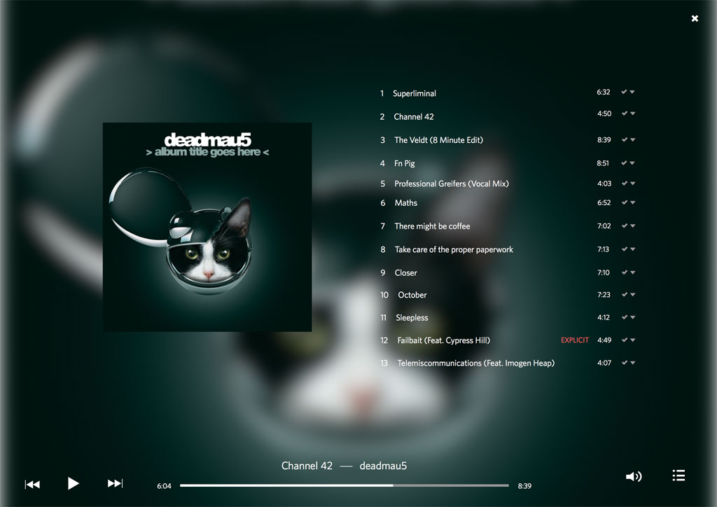
Rdio's Desktop Music Player -- Recreated with Sketch
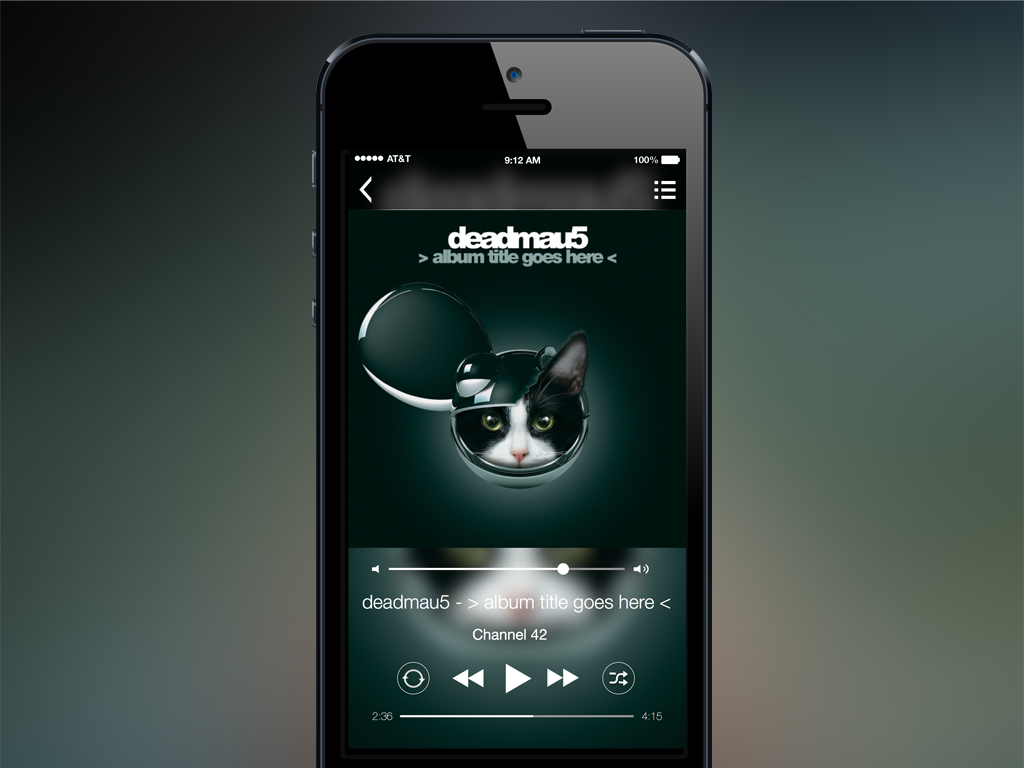
I really liked the blurred cover art concept. So I applied it to the mock iOS app. The blurred image is a mask created in sketch that is used as the app’s background. Another layer of the cover art is applied on top of the blurred image with the music controls underneath. There is no overlay mask applied to the music controls. The controls are layered directly on top of the blurred image. Which in hindsight may not be a very good decision since the album title and artist name can be difficult to read. The playlist, which can be accessed with the hamburger icon located on the top right, still has the blurred cover art as the background. A mini-player is located at the bottom where you would normally expect a toolbar. The choice of font is Helvetica Neue, the offical systmem font for iOS 7. The weight of the font is Helvetica Neue Light. But this first revision may benefit with a heavier weigh like Helvetica Neue Normal. The navigation background is set to black with an opacity value set to 70%. I did attempt to stay with the default theme of iOS 7. But decided to go with black rather than white. The back button remains as the iOS 7 chevron.
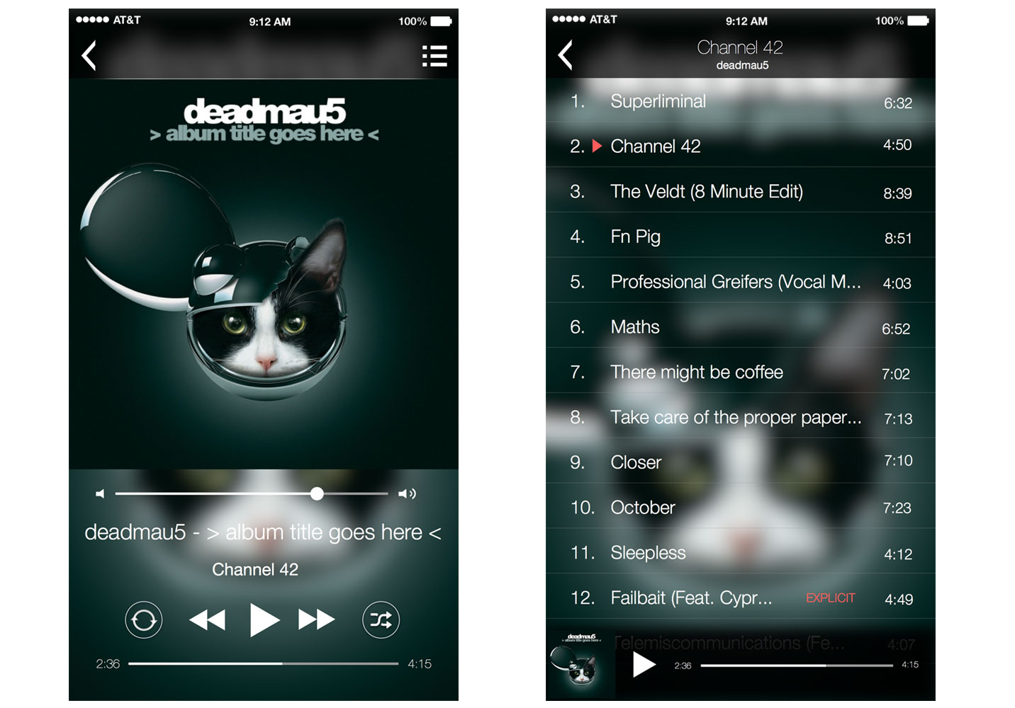
Music Player and Playlist
The music player menu utilizes the more popular side navigation layout with the back button as the toggle to expand and collapse the menu. I decided not to opt the more traditional hamburger menu glyph since it has already been used to signal the playlist of the album. A mini-player was added above the menu options to give the user context and control of music playback. I liked the simple idea of giving the user control of playback on every app screen.
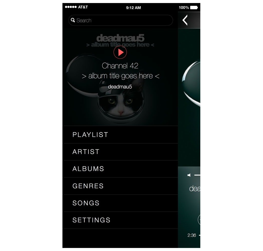
Music Player Menu
This was a quick and simple exercise of taking a design I found interesting and fun and expanding it to an iOS app. I never intend to fully develop this idea by actually developing this sort of music player. I just used it as an opportunity to design an iOS app that I may find interesting and useful for me. Below is a link to the music player’s sketch file.
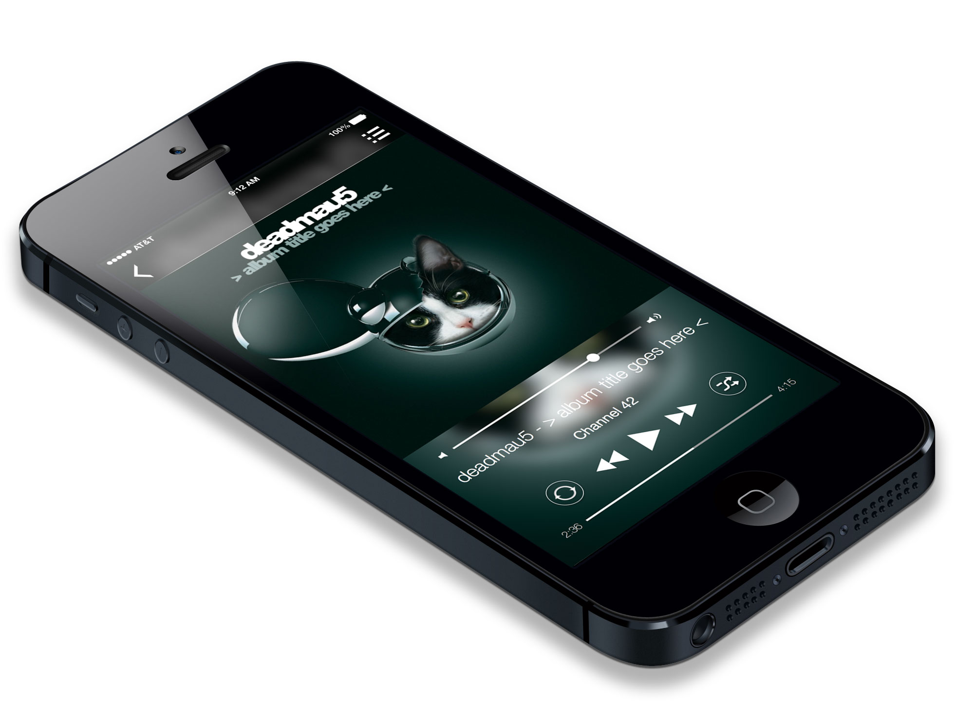
Music Player on iPhone 5